ADDUMI
Development of a brand of Pan-Asian cuisine ingredients
2021
2021
Brand logo
A task
To create a brand of Pan-Asian cuisine ingredients for a company from Grozny:
1. Market research
2. Analysis of competitors
3. Positioning
4. Maritza values
5. Naming
6. Logo and design system
To create a brand of Pan-Asian cuisine ingredients for a company from Grozny:
1. Market research
2. Analysis of competitors
3. Positioning
4. Maritza values
5. Naming
6. Logo and design system
Ride the wave of market development
The Okean company was founded in Grozny in 1992. The main direction is the wholesale of fresh-frozen fish and seafood in the Chechen Republic. Initially, the Ocean did not have an unambiguous focus on one or another segment, but Pan-Asian delivery services, in particular - Japanese cuisine.
Noticing this, from 2017, in parallel with seafood, the company in test mode launched the sale of related ingredients from Russian manufacturers: rice, nori leaves, various sauces and disposable consumables - what ; made it possible to cover most of the needs of customers. Three years later, there was a need to create your own brand.
"Many are called, few are chosen"
Already at the first stage of negotiations, our client made it clear that his business is focused on Chechnya and development within the region is much more priority than expanding deliveries to the federal scale. We took this into account when developing the strategy and made more emphasis in the research on the study of the business culture of the region.
We studied the market of Japanese cuisine ingredients in Russia and saw that there are very few truly authentic brands from abroad. All of them are rare, expensive and hard to get. The main request is met by local producers, 80% of which mimic foreign products, the rest only adapt Asian aesthetics, but they speak about their Russian origin unambiguously.
We also noticed that almost all brands are owned by three major manufacturers. This indicates that goods of different brands, produced at the same enterprise, are essentially the same and cannot compete with each other for due to composition, taste or# nbsp; other properties. Thus, branding comes to the foreground, because you can stand out from the competition only with the help of design, service model and well-developed communications.
"You won't pass" or how a brand can become a pillar of the region's infrastructure
We decided to abandon creating the illusion of an authentic trademark, because this approach has lost the effect of novelty and stopped working: no matter how verified the brand was, in soon all those interested will find out that in fact, it belongs to a local entrepreneur, and the products are made under Moscow.
The popularity of Japanese cuisine in Chechnya ensures the rapid growth of the market, but many issues associated with supplies are difficult. In this system, a new brand should become a kind of filter that will not let low-quality ingredients through: it will take the labor and responsibility to double-check everything, choose the best and offer it to its partners.
This philosophy suits our customer well, because he is not engaged in independent production of goods - he only finds quality products from Russian manufacturers, delivers to home region and sells under its own brand, simplifying life of local entrepreneurs.
Thus, we have identified two main characteristics of the brand:
- "Personal Guarantee" is a brand that does not hide its faces, preserves its reputation and is not afraid to take on responsibility.
- Vysshaya Liga is a modern professional brand that unites its clients with knowledge and experience, helping them to achieve the best results.
The secret ingredient...
Focusing on market research in the region, we developed the name - ADDUMI. The main parameters of the choice were simplicity and comfort: this word is convenient in pronunciation for the inhabitants of Chechnya, since their or imitating under Japan trademarks.
ADDUMI is a neologism formed from the English verb "add" - to add, increase. Thus, the message to partners is encrypted in the name: ADDUMI products are exactly those secret ingredients that you must add to your dishes.
The name is included in the associative array with the concepts of "recipe", "additive", "term" and according to it imitates Japanese speech, but doesn't declares about its exceptional authenticity. In order to maintain a balance between the national flavor of Japan and local production, we decided to make the Latin version the main variant of the title.
…and a touch of authentic symbolism
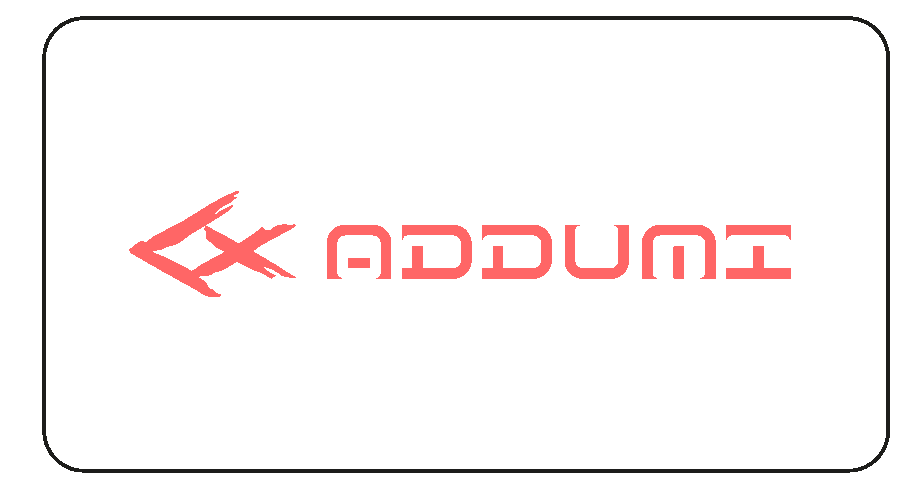
The logo of the ADDUMI brand is based on the image of a carp, which is called Koi in Japan. Traditionally considered a symbol of perseverance, because this is one of the few fish that can swim against a strong current. Koi is also associated with strength of mind and stubborn struggle - qualities without which you can't survive in business.
We stylized Koi's insignia of an artisan, as if in a few quick strokes of traditional Japanese graphics. This figure also encoded the Latin letter "A" - the first letter of the brand name.
In contrast to the logo, the font styles of the name are more modern and reminiscent of squares with distinctly rounded corners. Barely noticeable serifs hint at belonging to the Japanese flavor.
Project team: Alexander Glazov, Alexey Ignatiev, Artur Sagitov, Natalie Cristea
Case text: Egor Smirnov
Focusing on market research in the region, we developed the name - ADDUMI. The main parameters of the choice were simplicity and comfort: this word is convenient in pronunciation for the inhabitants of Chechnya, since their or imitating under Japan trademarks.
ADDUMI is a neologism formed from the English verb "add" - to add, increase. Thus, the message to partners is encrypted in the name: ADDUMI products are exactly those secret ingredients that you must add to your dishes.
The name is included in the associative array with the concepts of "recipe", "additive", "term" and according to it imitates Japanese speech, but doesn't declares about its exceptional authenticity. In order to maintain a balance between the national flavor of Japan and local production, we decided to make the Latin version the main variant of the title.
…and a touch of authentic symbolism
The logo of the ADDUMI brand is based on the image of a carp, which is called Koi in Japan. Traditionally considered a symbol of perseverance, because this is one of the few fish that can swim against a strong current. Koi is also associated with strength of mind and stubborn struggle - qualities without which you can't survive in business.
We stylized Koi's insignia of an artisan, as if in a few quick strokes of traditional Japanese graphics. This figure also encoded the Latin letter "A" - the first letter of the brand name.
In contrast to the logo, the font styles of the name are more modern and reminiscent of squares with distinctly rounded corners. Barely noticeable serifs hint at belonging to the Japanese flavor.
Project team: Alexander Glazov, Alexey Ignatiev, Artur Sagitov, Natalie Cristea
Case text: Egor Smirnov
© 2014-2022