

STANVER
Russian manufacturer of mobile asphalt concrete plants, Republic of Mari El.
Challenge:
To develop a brand complex for a manufacturer of mobile plants for the production of asphalt mixes:
To develop a brand complex for a manufacturer of mobile plants for the production of asphalt mixes:
- Conduct marketing research
- Develop a brand strategy
- Update positioning
- Build a matrix of values
- Create a name, logo and visual style
STANVER
Russian manufacturer of mobile asphalt concrete plants, Republic of Mari El.
Challenge:
To develop a brand complex for a manufacturer of mobile plants for the production of asphalt mixes:
- Conduct market research
- Develop a brand strategy
- Update positioning
- Build a value matrix
- Create a name, logo and visual style
Company today:
Previously, the plant was called DrobTehMash - a Russian manufacturer of mobile asphalt concrete plants, the Republic of Mari El.
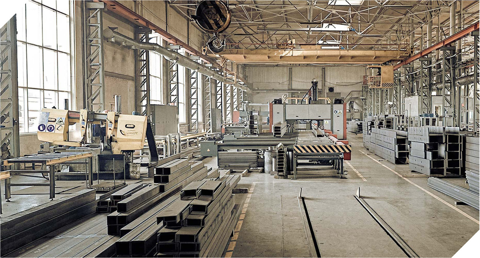
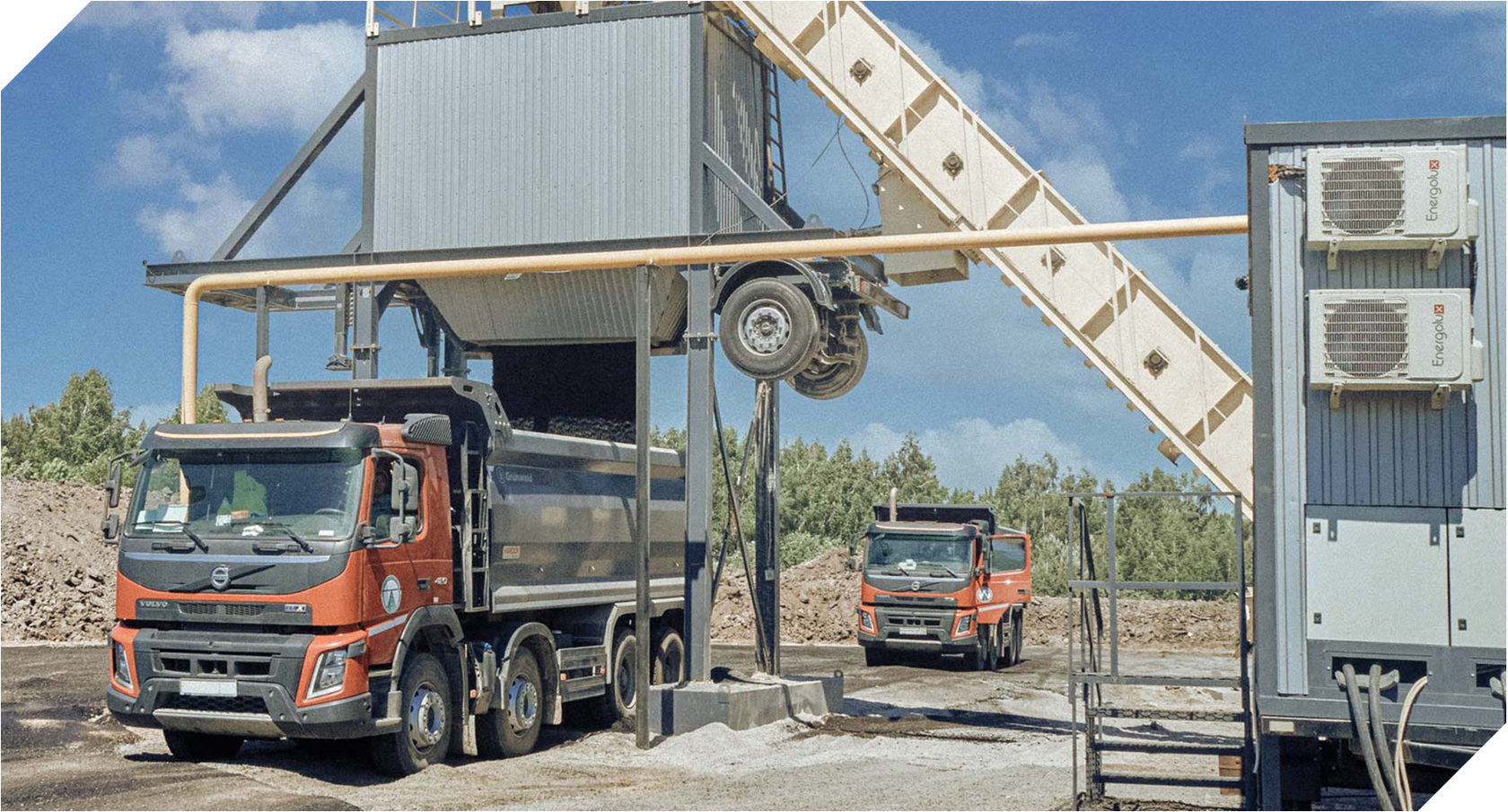
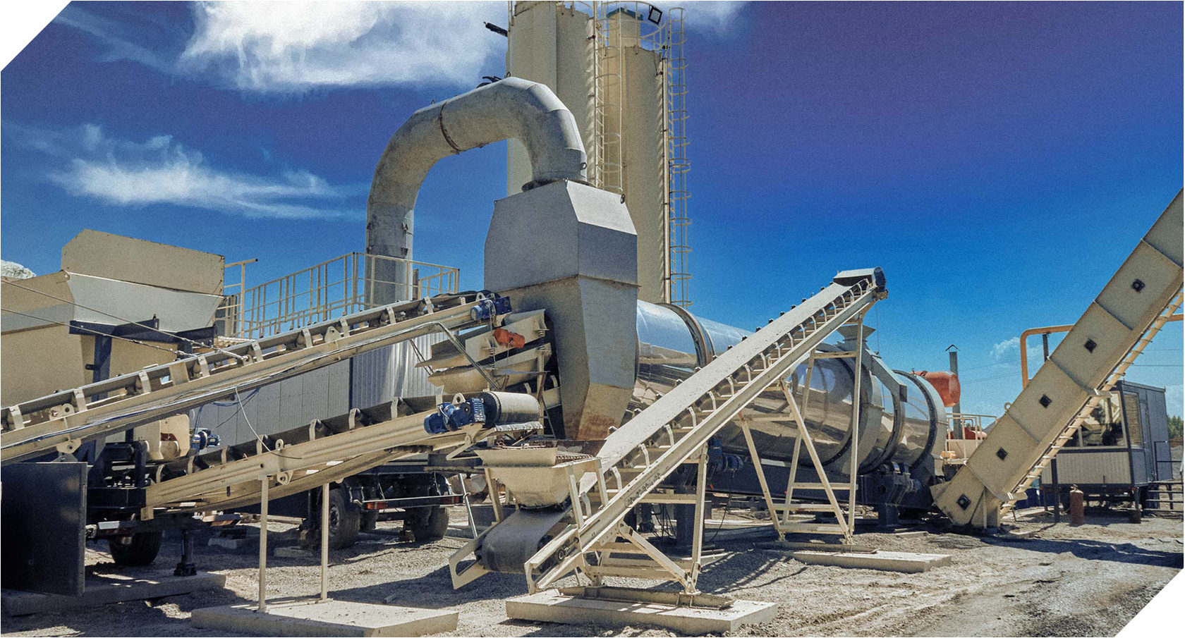
Mobility as a parameter is of key importance: such a plant can be quickly and easily transported to any distance. Its installation does not require a foundation, and the control system does not require highly qualified personnel. DrobTechMash creates domestic plants of a continuous type following the example of European and American manufacturers. The factories operate with up to 50% recycled materials, minimal emissions and low energy consumption.
Mobility as a parameter is of key importance: such a plant can be quickly and easily transported to any distance. Its installation does not require a foundation, and the control system does not require highly qualified personnel. DrobTechMash creates domestic plants of a continuous type following the example of European and American manufacturers. The factories operate with up to 50% recycled materials, minimal emissions and low energy consumption.


Research:
"They don't make good equipment in Russia" - the new brand of the company had to fight this stereotype.
The majority of Russian producers of asphalt concrete either do not use marketing tools at all or are at the initial stages of their implementation. Many companies use cliches - complex graphics, abbreviations and names come from the USSR. The positioning of domestic manufacturers is based solely on rational advantages, although the world's largest brands of road equipment convey information about themselves through an emotional message.
Conclusion-decision
Having studied the market, we concluded: the new brand should position itself as the leader in the continuous asphalt plant production in Russia, but rely on a well-developed emotional value. This will ensure sustainable competitiveness in any situation.
Conclusion-decision
Having studied the market, we concluded: the new brand should position itself as the leader in the continuous asphalt plant production in Russia, but rely on a well-developed emotional value. This will ensure sustainable competitiveness in any situation.


Positioning:
The main idea of the brand is the continuity of knowledge as a continuous development. Any road is endless, one path passes into another, symbolizing constant, continuous movement. This metaphor also works for technology that never stops.
Naming
The new name of the company was the neologism Stanver. It located in the semantic field of the concepts of faith and becoming, is close to them in sound and causes stable associations with reliability and durability. In order to effectively emphasize the experience of European technologies, the Latin version has become the main name, however, its Russian transliteration sounds no less strong.

Brand line:
ABZ. Created in Russia.
ABZ. Created in Russia.
We had concerns that Stanver - the main variant of the name - could overshadow the national identity of the domestic brand, give it a too European look. Thus, an unambiguous and understandable brand line was created: "ABZ. Created in Russia".
Logo
Before
After
Before
After
The logo uses a sans-serif font associated with manufacturability and functionality. The name of the company is spelled out in lowercase letters - they demonstrate the openness and modernity of the brand. The word is placed in a rectangle with beveled corners, which increases the weight of the sign and symbolizes the hidden scale. Such rough geometry emphasizes the features of the industry. With this, the diagonal orientation speaks of the movement and continuous growth of the company. Due to the simple form and graphic character of the sign, it can be easily applied both on metal parts by chasing, and and in the form of a nameplate.
The logo uses a sans-serif font associated with manufacturability and functionality. The name of the company is spelled out in lowercase letters - they demonstrate the openness and modernity of the brand. The word is placed in a rectangle with beveled corners, which increases the weight of the sign and symbolizes the hidden scale. Such rough geometry emphasizes the features of the industry. With this, the diagonal orientation speaks of the movement and continuous growth of the company. Due to the simple form and graphic character of the sign, it can be easily applied both on metal parts by chasing, and and in the form of a nameplate.
Tagline:
Continuity of quality.
Continuity of quality.
The technology for the production of continuous type asphalt asphalt is the main competitive advantage of Stanver at the moment. However, over time, it may lose its uniqueness, so we have focused on the "quality", which will never lose its significance. "Continuity" provides the brand with a sustainable platform for development.
Tagline:
Continuity of quality.
Continuity of quality.
The technology for the production of continuous asphalt asphalt plants is the main competitive advantage of Stanver at the moment. However, over time, it can lose its uniqueness, so we have focused on "quality", which will never lose its significance. "Continuity" provides the brand with a sustainable platform for development.
Style
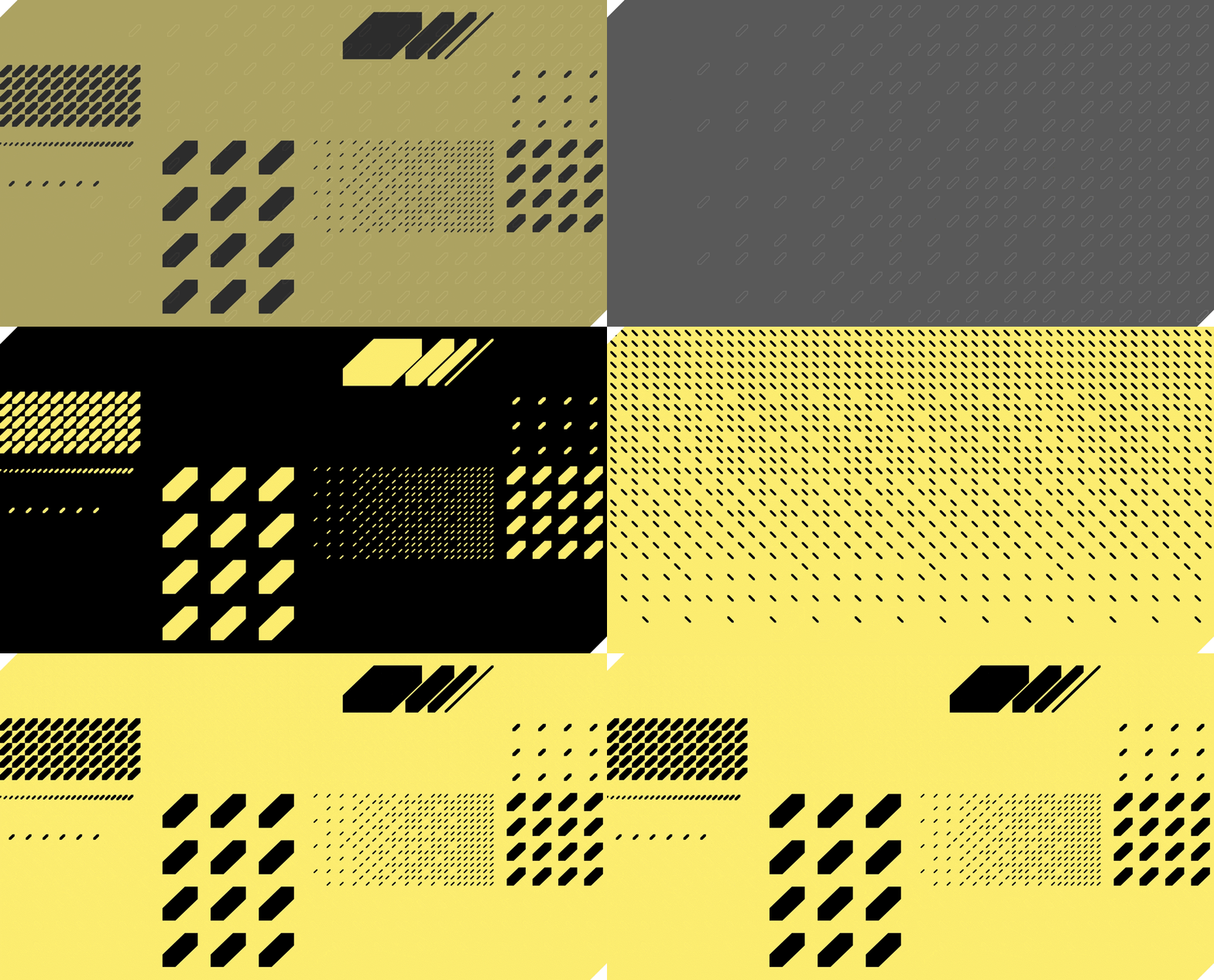
Pattern - stylization of bulk materials of various fractions. Its variability makes it easy to adapt the pattern to different media.
Color scheme - Yellow (accent) and dark gray (background) colors. Historically, manufacturers have painted road vehicles a certain neutral warm yellow. Choosing yellow as one of the brand's primary colors, we emphasized the continuity of technology, but softened the hue, making it lighter and more visible. Dark gray contrasting, but calm and businesslike color favorably sets off the brightness of yellow.
Color scheme - Yellow (accent) and dark gray (background) colors. Historically, manufacturers have painted road vehicles a certain neutral warm yellow. Choosing yellow as one of the brand's primary colors, we emphasized the continuity of technology, but softened the hue, making it lighter and more visible. Dark gray contrasting, but calm and businesslike color favorably sets off the brightness of yellow.

Evolution
Project team
Timur Karimov, Natalie Cristea, Artur Sagitov, Maxim German, Philip Olenikov, Egor Smirnov, Alexander Glazov, Alexei Ignatiev.