Naming
Positioning
DEVELOPMENT OF A BRAND OF CONSUMABLES, PARTS AND ACCESSORIES FOR HEAVY CONSTRUCTION, FORESTRY AND ROAD EQUIPMENT

Market research
Logo and visual style

CHALLENGE
Develop a new brand of consumables, parts and components for heavy construction, forestry and road equipment
WHAT WAS DONE
Market research
1
Positioning development
2
Naming
3
Logo and visual style
4
RESEARCH
Cold. Swamp, Sand. Stones. Water. Forest. Dirt. In fact, all this is the working conditions of the equipment for which we supply spare parts and materials.
IN THE HEAVY MACHINERY MARKET BUYERS PREFER STABILITY OVER INNOVATION
For owners it is important that the machines are first of all in good working order, because the failure of every single part can lead to serious delays in the schedule and huge losses.
EVERY DAY ONE MACHINE HARVESTS 350 CUBE OF FOREST. ONE CUBE ONLY COSTS ABOUT 4 THOUSAND RUBLES. IF MULTIPLYING THESE NUMBERS, WE GET THE AMOUNT THAT THE OWNER OF THE EQUIPMENT WILL LOSE FOR ITS SIMPLE - AND THIS IS ABOUT RUB 1,500,000
Such innovations are dictated by the general requirements of the market, but owners do not always need super smart and sensitive equipment to complete tasks. Many customers look back with nostalgia to the times when cars were less modern and more reliable.
Manufacturers often add high-tech sensors to equipment that cannot be repaired on site.
Most domestic companies minimize losses through cheap labor. Even 20 years ago, the driver had to master the skills of a mechanic, because the distances to the nearest repair service are huge.
Then the machines were simpler, but today, without the help of a specialist from the service department, it is not always possible to understand which element of the mechanism has failed. In such conditions, the best solution is to get spare parts as soon as possible, but it is not easy to choose them. There is a problem of "imposed non-alternativeness" on the market: buyers have the opinion that there are only original products, and everything else is a fake.
This greatly limits the choice. Many customers are more suitable for high-quality "non-original" consumables, the purchase of which will not allow downtime, but because of stereotypes, they are afraid to purchase them.
RESEARCH
The new brand should move away from the concepts of "original" and "non-original": there are only equipment and consumables that meet the specific requirements of a particular client. You need to sell not a product, but solutions to customer problems, providing a choice of at least two equally successful options.
Speed plays a big role here: many customers need to get parts in the shortest possible time, because the expense of losses from equipment downtime is literally measured in hours. These buyers will prefer, of all parts manufacturers, the one that saves them time.
From the point of view of the communicative approach, the brand should be present wherever the client needs to find solutions related to the operation of equipment.
From the point of view of the communicative approach, the brand should be present wherever the client needs to find solutions related to the operation of equipment.
POSITIONING
The new brand should stand out from the competition and be the first to come to mind when mentioning the industry
IN SEARCH FOR THE MAIN IDEA OF THE BRAND, WE COLLECTED A WORD CLOUD THAT REFLECTS THE NATURE OF THE PRODUCT AND KEY USERS
First line, leadership
Unpretentiousness: taming nature, hardness
Skill, trust, individual approach
TWO METAPHORS THAT CONVEY THE ESSENCE OF THE PRODUCT
Vanguard
The brand itself is at the forefront: it does not stand in the shadows and is not afraid to deal with difficulties. "We know which parts will definitely not let down the owners of heavy construction and forestry equipment"
Constructor
The brand acts as an experienced craftsman who has gone through many paths and knows what works best in a particular situation.
POSITIONING: A DESIGNER WHO KNOWS WHICH SOLUTION WILL EXACTLY WORK IN A PARTICULAR SITUATION, BECAUSE ALWAYS AT THE EDGE OF THE INDUSTRY.
We are able to analyze the client's task and give a specific solution that will not only fulfill the order, but will also be optimal in terms of price / quality / time
NAMING
Our client's brand includes an impressive product range. To solve the task, we had to develop a name in 11 classes of the Nice Classification
THIS WORD IS VERY DIFFICULT TO CREATE, EVEN IF IT IS A NEOLOGISM, BUT
WE FOUND A WAY
WE FOUND A WAY
As a name, we decided to use an English neologism that reflects the concept of craftsmanship and craftsmanship.
TERRACRAFT is a word formed from several derivatives
TERRACRAFT is a word formed from several derivatives
TERRA
SKILL
CRAFT
TECHNIQUE
CRAFT
EARTH
TERRACRAFT evokes associations with a company that stands firmly on its feet, and also refers a potential client to the concepts of "qualification", "practice" and "substance".
The word "constructor" was used as the main metaphor.
The word "constructor" was used as the main metaphor.
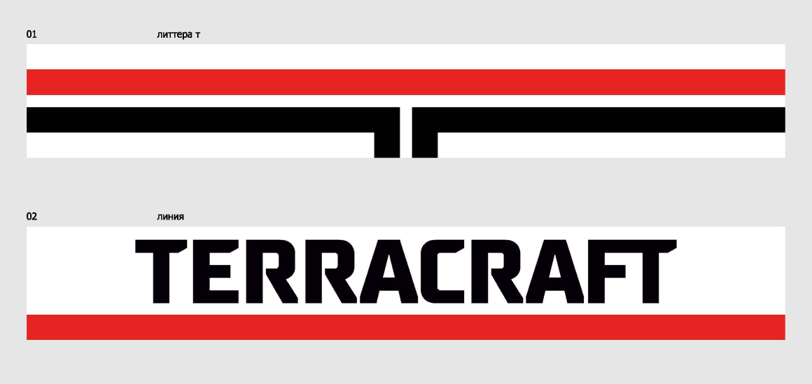
LOGO
To create a logo, we turned to the same meanings that are embedded in the brand name. In the word TERRACRAFT you can clearly hear "Terra" - earth
ANY TECHNOLOGY LEAVES A TRAIL ON THE GROUND, WHETHER IT IS THE RESULT OF LONG
WORK OR THE INSTANT PRINT OF A TIRE ON THE SAND. BY COMBINING THE IDEA OF THIS "IMPRINT" WITH THE LETTER "T" (THE FIRST LETTER OF THE BRAND NAME), WE DEVELOPED A LOGO.
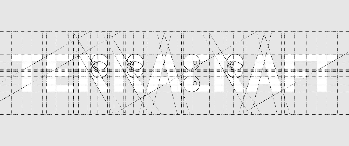
When building the logo, we resorted to simple geometry, using only squares. Due to geometric simplicity, the figure can be read and reproduced on any media.
Especially important for us was the ability to accurately cast the logo in metal, because this is the method used to brand TERRACRAFT products. The letter "T" symbolically reflects the three areas in which TERRACRAFT works: construction equipment, logging and roadworks.

The font solution is complicated compared to the logo: in addition to straight lines and simple geometric shapes from which the letters are built, we added oblique cuts at the edges.
We used this stylistic decision as a tribute to the classic technical font. Today, such styles are not common, so in terms of style they bring freshness, but at the same time emphasize continuity.
The color scheme is based on the classic triad: red, white and black. Red color reflects internal energy, it is our eye that sees it first and reads it the fastest.
White and black colors frame the main shade, emphasizing the graphic elements.
EVOLUTION OF STYLE
Project team
Philip Olenikov
Egor Smirnov
Alexander Glazov
Alexey Ignatiev
Sagitov Artur
Natasha Cristea
Philip Olenikov
Egor Smirnov
Alexander Glazov
Alexey Ignatiev
Sagitov Artur
Natasha Cristea