ORANGE
BANK
REBRANDING OF A FINANCIAL INSTITUTION

2015 - 2019


PromServiceBank was founded in the city of Bratsk in 1991. From the beginning of its existence, it differed from competitors by its unique approaches to doing business: it created its own IT-architecture, integrated products into partner business systems, organized field service and ;given the opportunity for clients to communicate directly with top management.
COMING FROM SIBERIA
By 2014, PromServiceBank built a network of branches from Moscow to Blagoveshchensk and moved the head office to Petersburg. Along with the geography, the target audience has also changed: the expansion of B2B and active work with the B2C segment led to a change in the positioning of services. The new conditions required a change in approaches, and the bank started rebranding on its own. Started with name: so the bank became Orange.
Known in the territory of the native and several nearby regions. As a rule, they develop the brand intuitively, take many impulsive steps. The brand concept is chaotic.
Local
Firms that give out sums of money quickly and at the maximum percentage. Exist because of aggressive advertising without any positioning. For such organizations are characterized by straightforward names in the complete absence of a brand.
Microfinance organizations*
We conducted this study in 2015, when the activities of MFOs were not controlled by from the side of the Central Bank. Such organizations were a quick way to get money and were popular, earning a bad reputation.

Known throughout all of Russia. They are distinguished by clear positioning and verified, recognizable brand concept.
Federal significance
Exploring the banking market, we identified several types of financial institutions.
MARKET RESEARCH
At the moment of the beginning of our cooperation, Orange was a local bank, however, from the point of view, it resembled an MFI or a home store. It was important for us to change this impression and show a different path to building a brand both in terms of positioning and from a design point of view.
The service model is a concept that combines strong business solutions and culture of relationships between the bank, employees and client. With this approach, employees become first-level customers, receiving support from company.
The terms of service and the list of products in the vast majority of banking operations, and it is no longer an tool important who offers what services; it is important how the client receives them. Today, loyalty relies on service more than benefit, so updating the service model* is easy to beginning of Orange's rebranding.
The value of banks has always been measured by two criteria: reliability and security. However, after entering the digital age, these advantages have ceased to be of decisive importance, because we no longer keep money in safes, and deposits are insured by the state.
We conducted 120 in-depth interviews with employees, partners and clients of the bank, and saw: Orange's strong point is in solving complex problems. This is not a typical market player with a standard product list, but a bank with a strong, professional team providing personalized service.
Federal banks at big budgets convey their values through repetition, but that doesn't mean smaller players should look worse. However, they need to think through their steps in two times more carefully.
These are "service delivery" tools that ensure the convenience of purchasing and using it.
1. Technology
Corporate culture of relationships with clients and employees, based on common values.
3. Relationships
Solutions "out of script", implying a manual mode of interaction with the client.
2. Service
Well-functioning generic products, a clear business model, marketing and promotion.
4. Business
We have formulated a service model of 4 elements.
SOLUTION
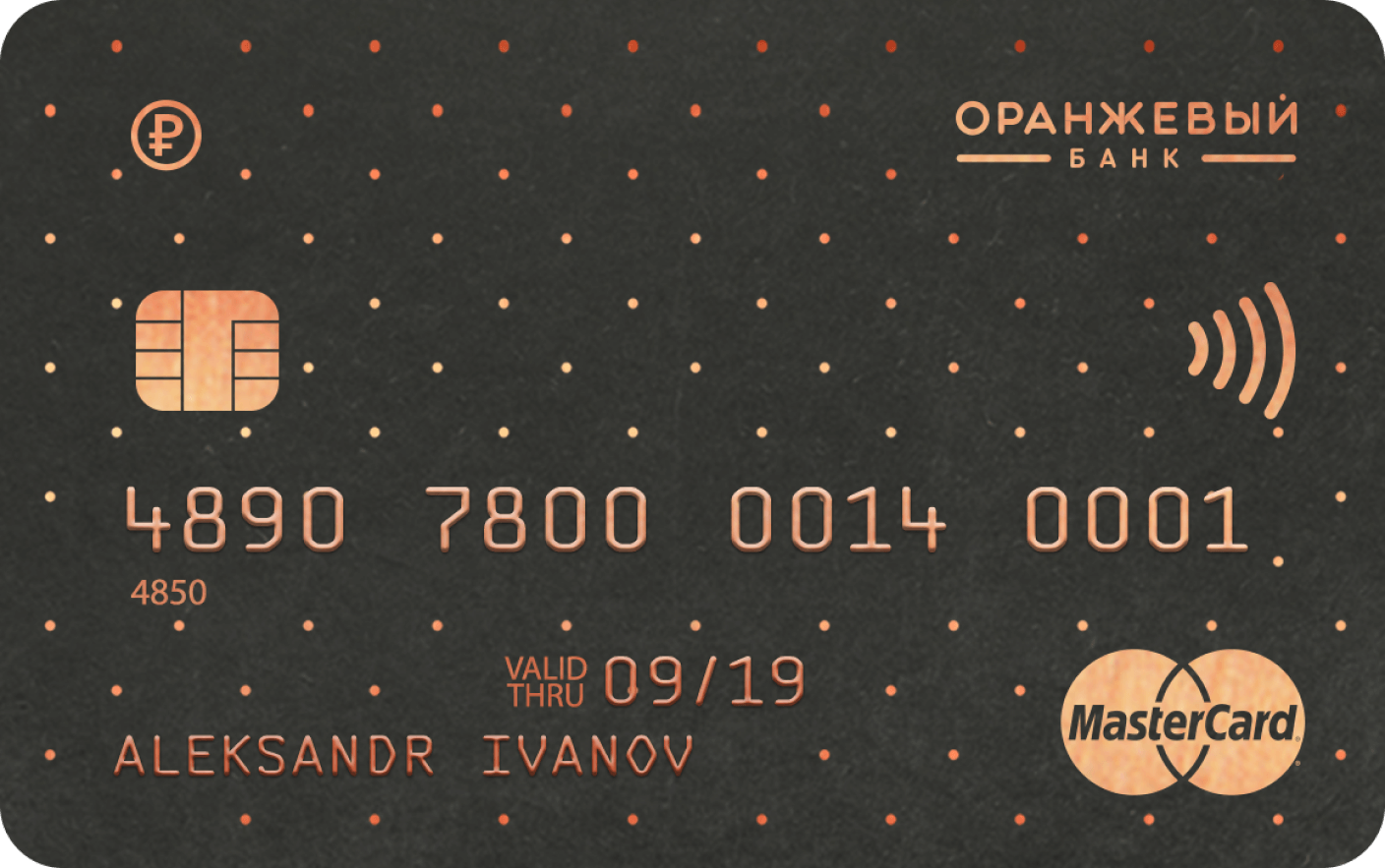
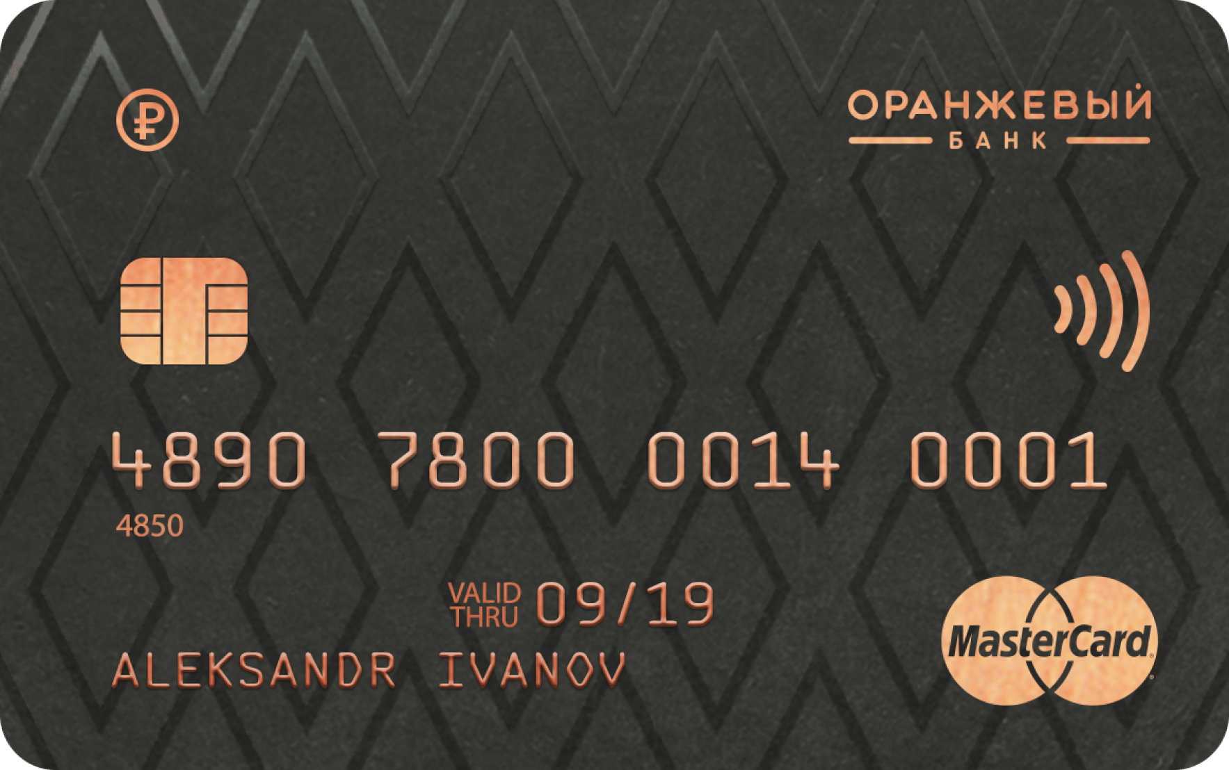
Becoming Orange, the bank changed its appearance. Developing the idea of brightness, the management decided to support the name with visual means.
DESIGN SYSTEM
We decided to abandon the use of color in communications, but keep the emotionality by taking it out of form into essence. The design system was based on achromatic shades: gray, black and white, and more restrained than before, orange - an accent that we used only on key elements. This approach provided the functionality of the design, making it convenient and understandable.
During the first year of work, the need to adjust the style became obvious — customers did not understand that this was a bank. The abundance of orange shades looked unconventional, but weakly associated with the sector of finance, because the name itself evoked many vivid associations and didn't need strengthening.
Gray / Graphite
Basic
Orange
Accent
Black
Additional
COLORS
In order to correctly convey the values of the bank, we used the textures of natural materials: we used the textures of natural materials:
So, orange was represented by copper and highlighted bronze.
This approach compensates for the lack of pure color in the design system. Creating the mood of the brand, we tried to replicate the feeling of early autumn, when the sun is still warm, but the world is already filled with bright colors.

For the correct transmission of shades, we have developed a photo filter without bright contrasts with an emphasis on warm colors. This helped keep the style in a strict, understandable conservative financial mood, making the photo materials softer and more natural.


When updating the logo, we don't change the recognizable typeface, because when changing the design it's important not to lose the base of loyal customers. We added some space between the letters, which made the font more expressive, removed the emblem in the form of a circle and larger the word "bank". The composition was balanced with an orange accent line.
LOGO
The values of Orange Bank's clients are diverse, but equal in their importance, therefore, going to the verbal level of communication, we developed a dynamic slogan: "Oh, this is ..." + a word that reflects the value of the client. This formula allows you to create a unique message for any communication situation. For example:
TAGLINE
Our partnership with Orange Bank lasted 5 years. During this time, it was created and developed:
PRODUCT DEVELOPMENT
presentation
pages
pages
2082
strategies
0
medium
0
hours
of brainstorming
of brainstorming
5400
hours
of lectures
of lectures
0
DEVELOPING A CORPORATE CULTURE, WE#NBSP;CREATED A LABORATORY OF IDEAS WHERE BANK EMPLOYEES COULD PARTICIPATE IN SOLUTION DEVELOPMENT AND#NBSP;GET THE OPPORTUNITY TO DEVELOP OUR OWN BUSINESS IDEA WITH THE SUPPORT OF ORANGE. THE NEW DESIGN SYSTEM HAS BEEN TAKEN, AND#NBSP;WE#NBSP;CONTINUED COOPERATION WITH#NBSP;BANK. HERE ARE SOME OF#NBSP;THEM:
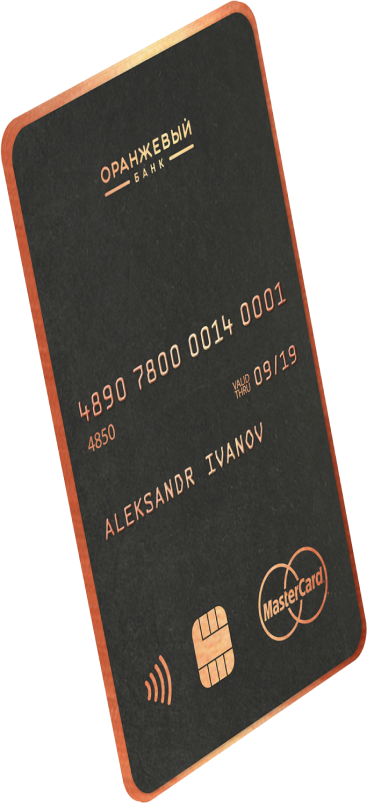
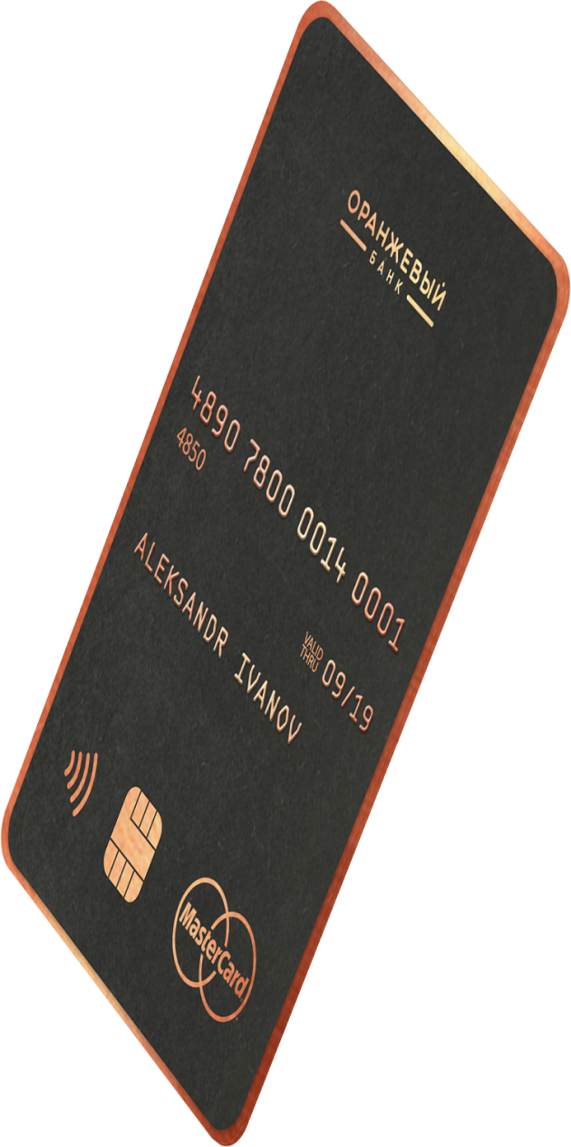
(1) Black cards
BANK CARDS
AND#NBSP;PACKAGING
AND#NBSP;PACKAGING
Visa Infinite and MC Black Edition - the most prestigious cards for clients with the highest solvency and unlimited financial instruments, provide comfort with access to private travel club and concierge - service.
A glossy geometric pattern on a matte background creates a hint of restrained elitism, necessary for such cards.
A glossy geometric pattern on a matte background creates a hint of restrained elitism, necessary for such cards.
(2) Packaging of Visa Infinite cards
Packing for Visa Infinite cards from dense, cotton, matte paper with stamping with copper foil. In the package there is a welcome letter with unique for each addressee text and insert with the benefits of the Priority Pass service.
(3) Gold and Standard cards
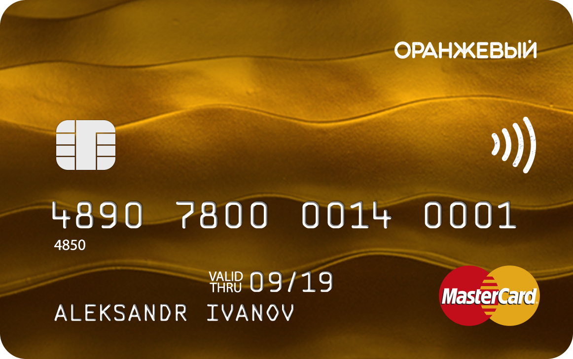
MasterCard Gold is a symbol of financial well-being. The special status of this card provides priority in service and privileges around the world.
Visa Classic is the most popular card type with a standard set of features.

(4) Packaging of Standard and Gold cards
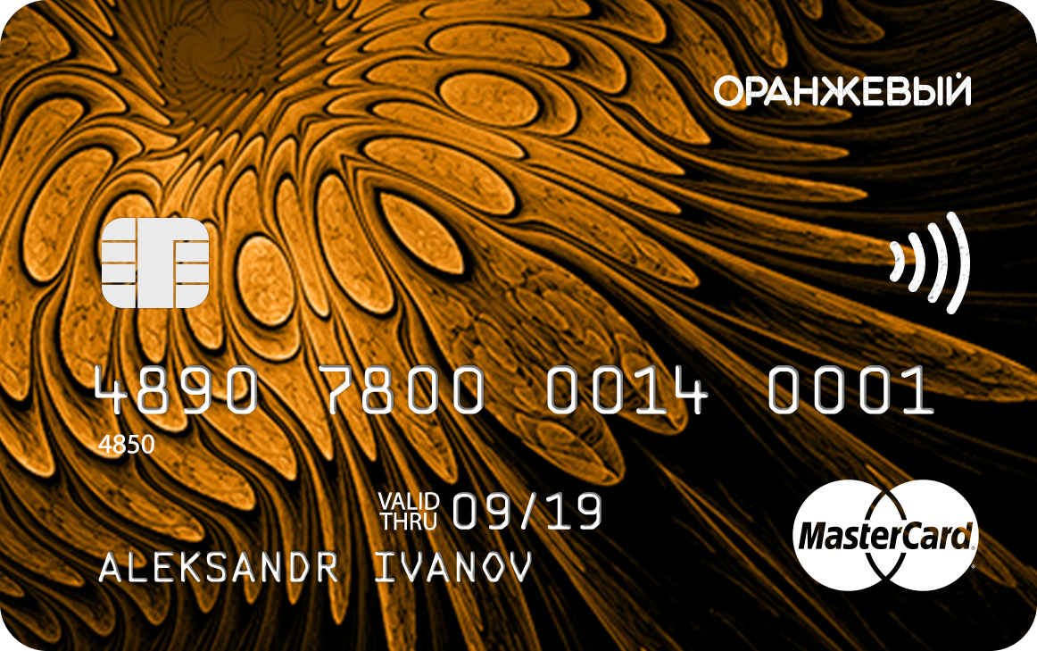
(5) Vertical card and its packaging
Visa Gold in vertical format - similar to a business card, attracts the attention of anyone who takes it in hands. The colored edging of the card gives a bright accent and easy to find among other cards in the wallet.
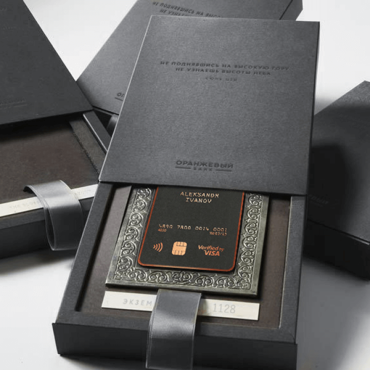
Packaging for vertical card Box from matte cardboard with ribbon. The map is housed in a patterned tin tab that gives it a handcrafted feel, as a symbol of personal touch.
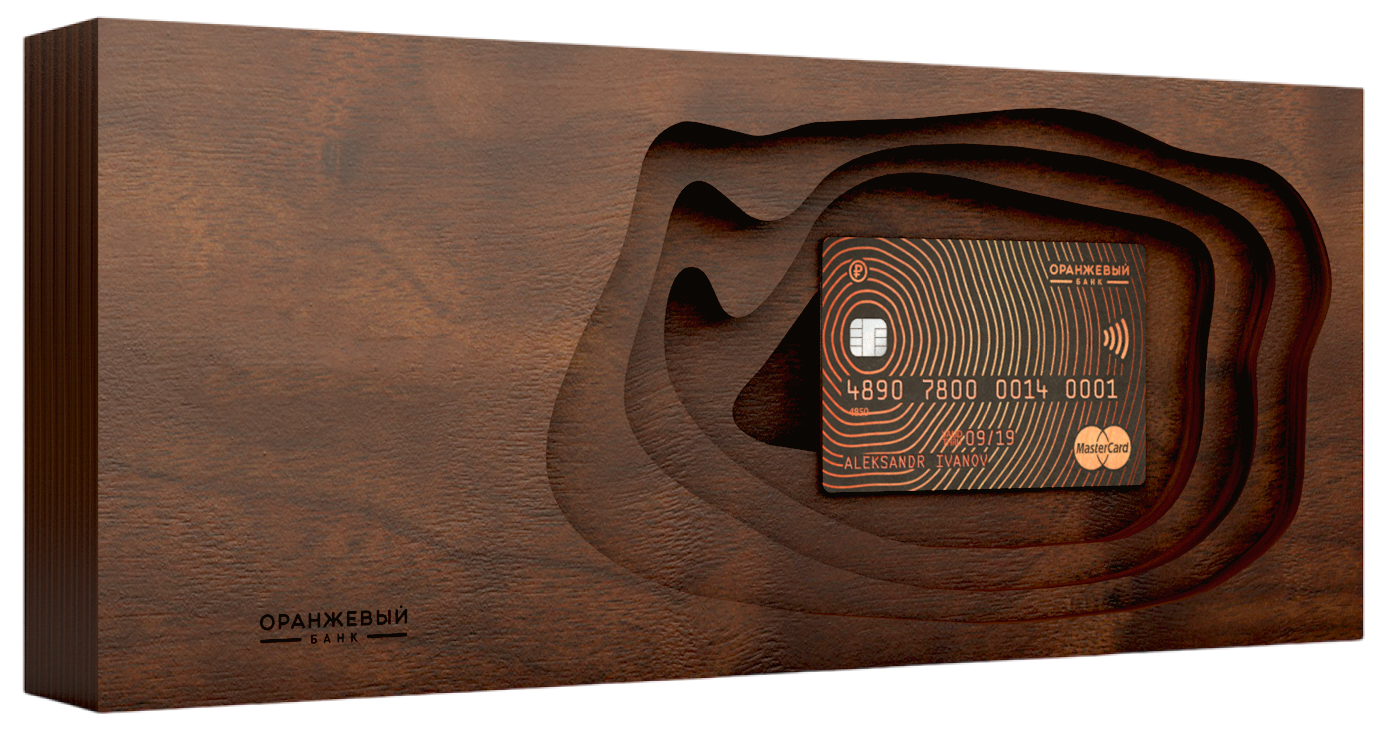
(6) Anniversary card with packaging
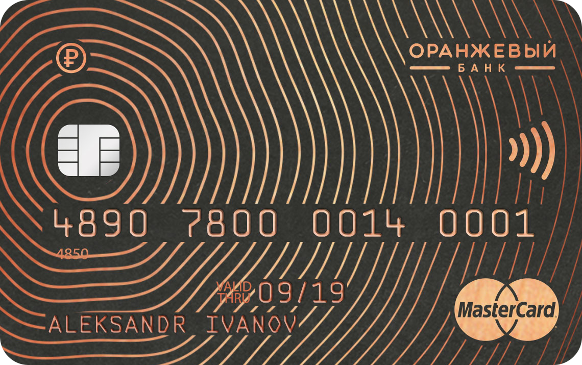
The card with the image of 25 tree rings was dedicated to the bank's anniversary and its experience of working with a large woodworking business. A gift box made from solid oak bar enhances the impression.
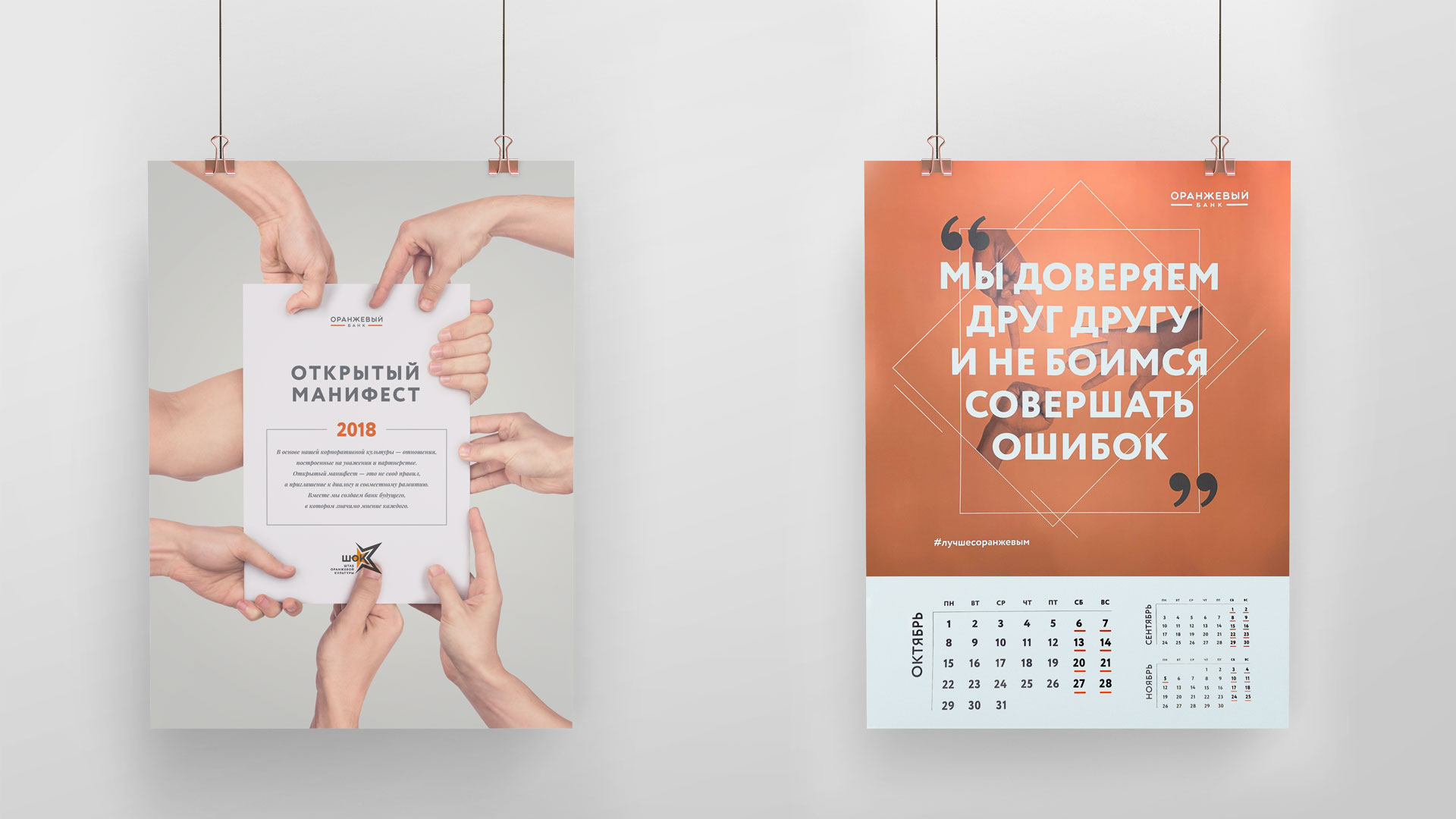
(1) Posters
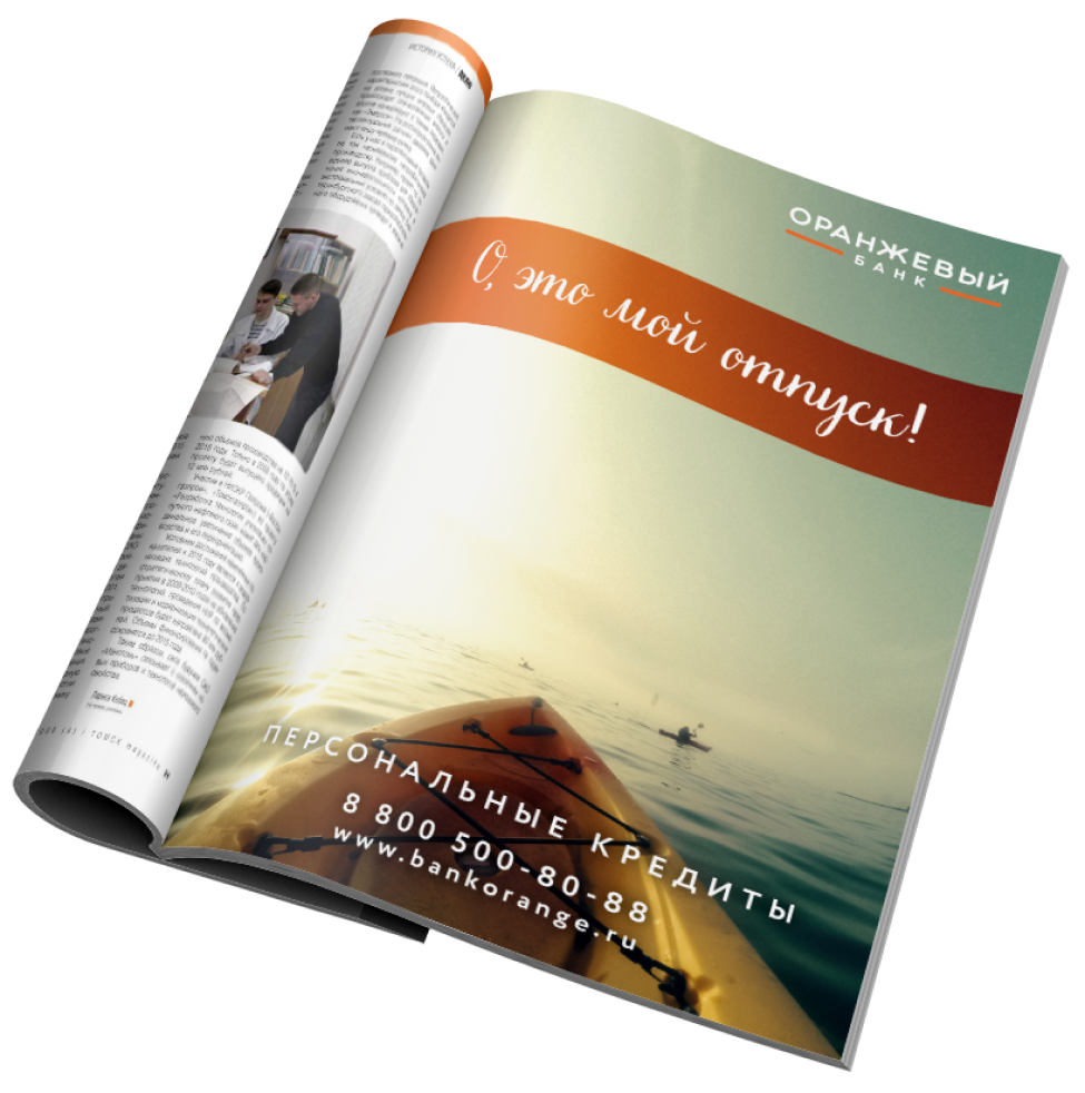
Advertising campaign dedicated to the rebranding of the bank, the bank's dynamic slogan "Oh, this is mine ..."
ADVERTISING AND MERCH

(2) Merch
Thermal mugs, souvenir for salary projects.

(1) Application
SITES AND APPS
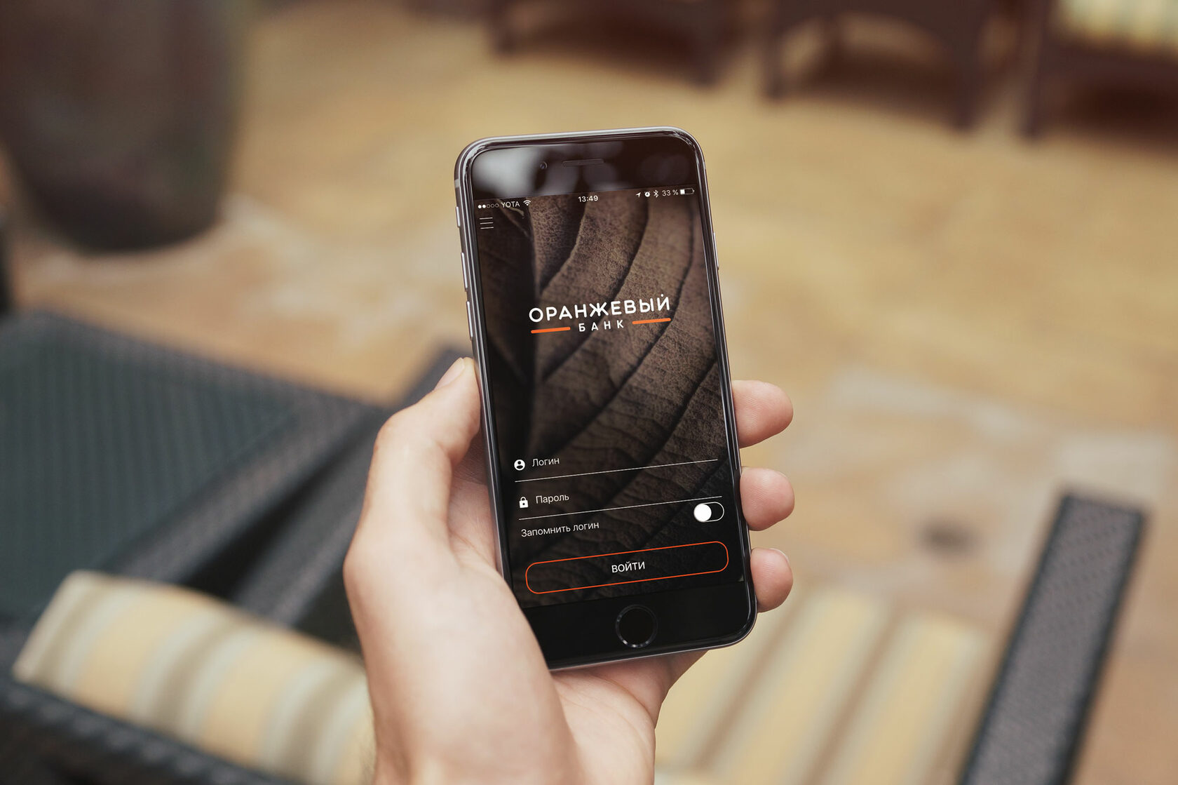
Soft and warm shades, smooth animation create a feeling of comfort and security for the user of the bank's mobile application.
(2) Main site and promo sites

The bright emotional background smoothly transforms into a grid of blocks with information of the main sections of the site.
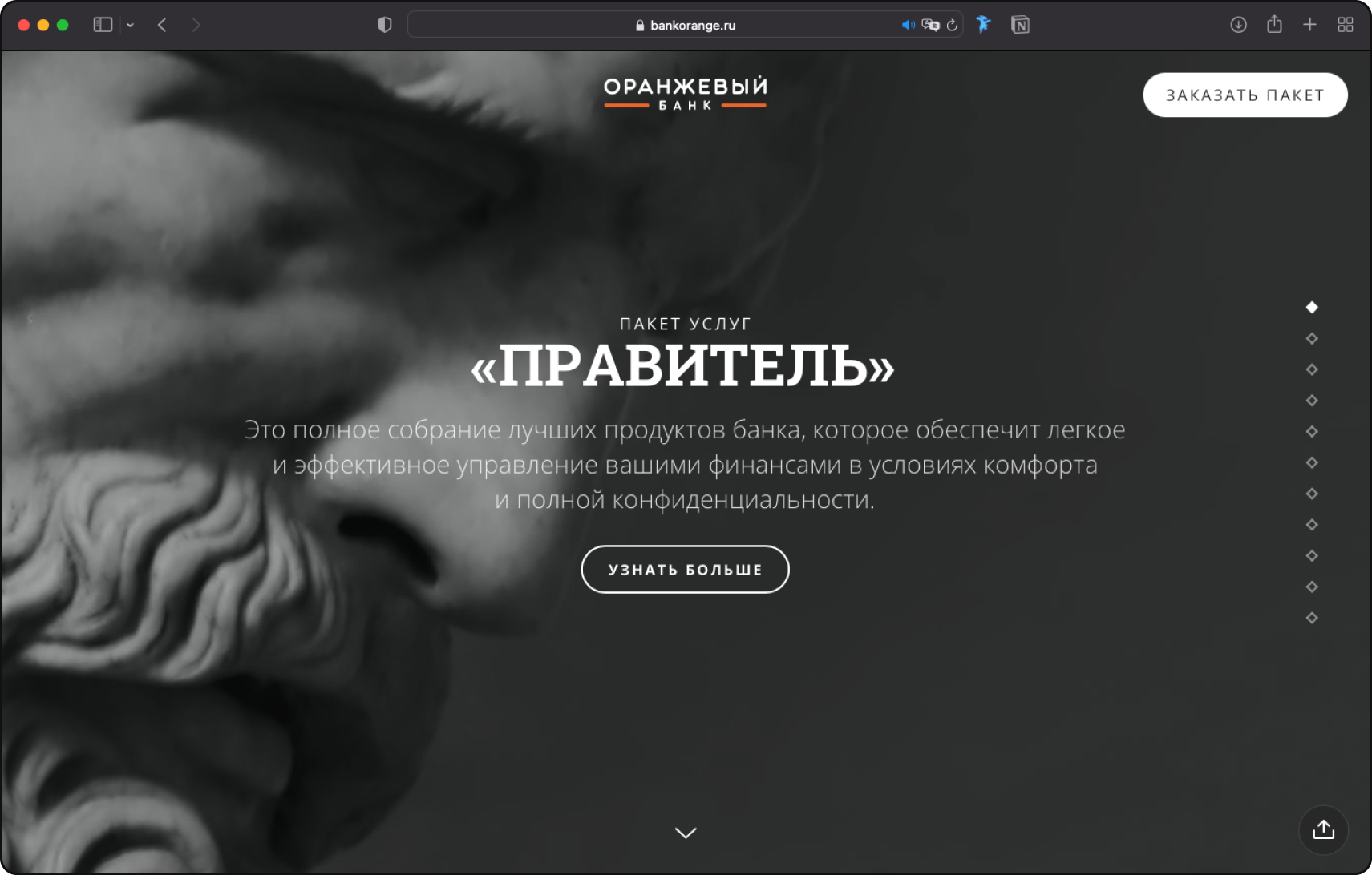
Package offer "Ruler"
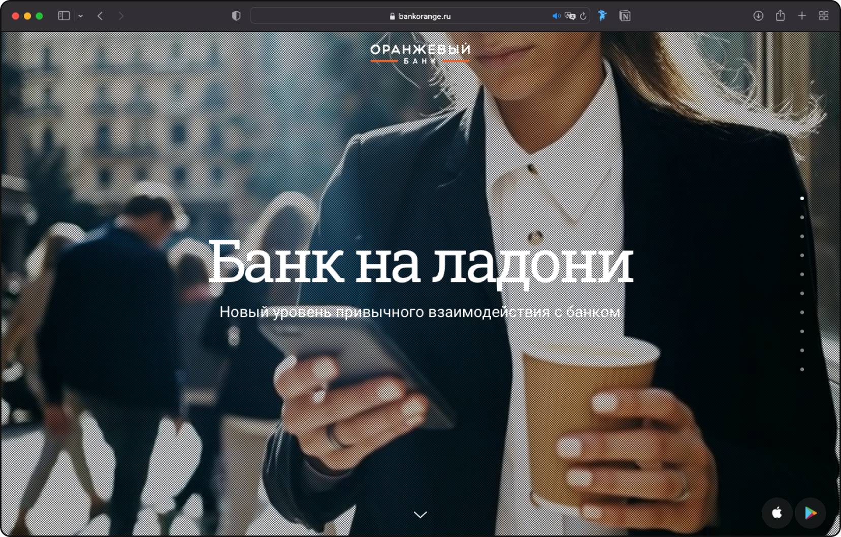
Promo site for the launch of a mobile bank
HR

Interactive calendar "Dreams are real". Connecting the dots every day, we are approaching the cherished dream.
A kaleidoscope of banknote fragments.
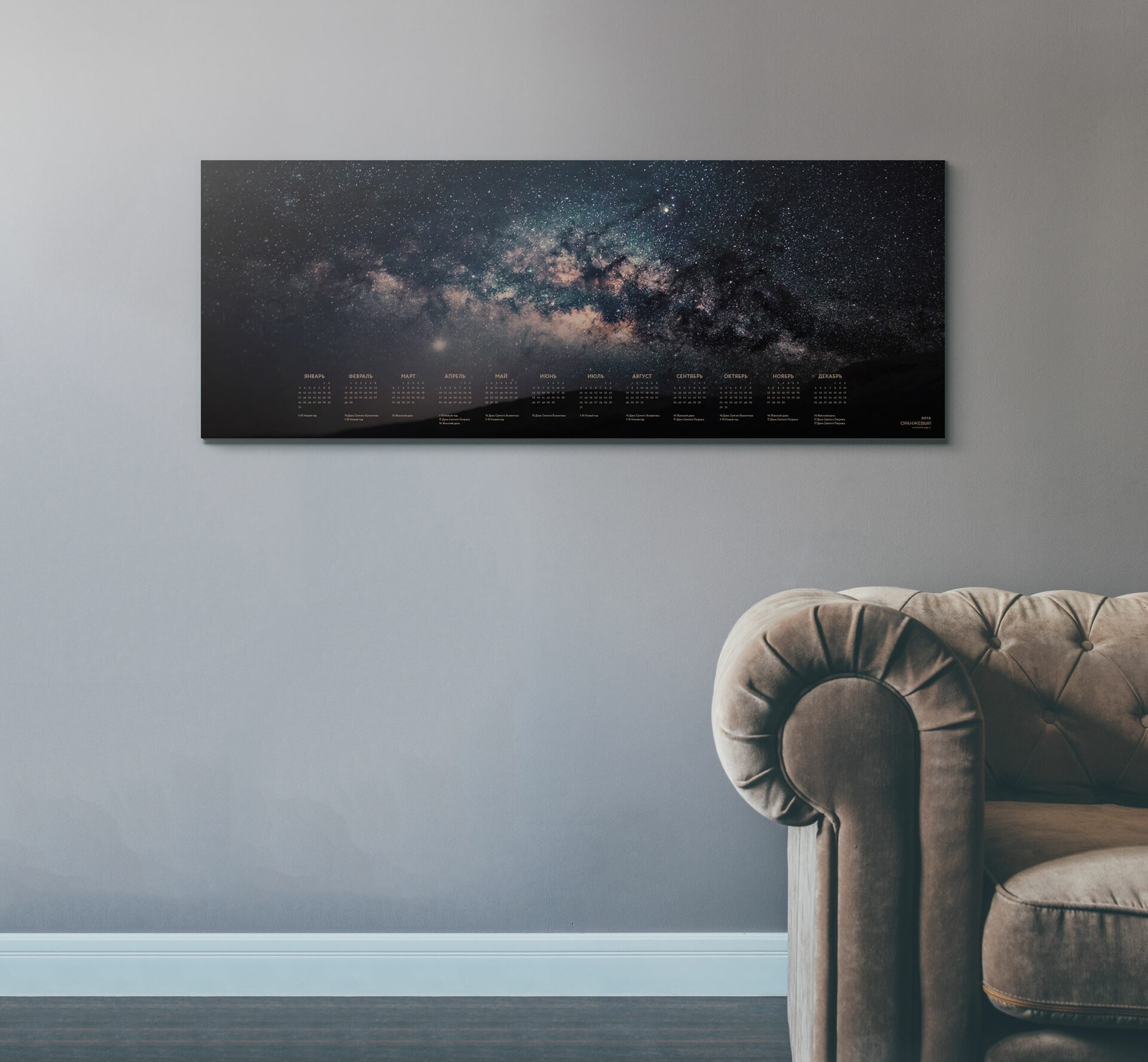
Universe calendar with stars glowing in the dark effect.

INTERIOR & EXTERIOR
Interior added natural materials, plants and warm lighting. Updating the interior made it possible to add intimacy and warmth, which is often not enough for financial institutions
For the presentation, a shooting of key executives and top management of the bank was carried out.
An investment presentation built on the visual contrast of photographs and bright energetic accents. Rhythm is created through a combination of charts and numbers with emotional quotes from the team.
PRESENTATION MATERIALS
(1) Rebranding and formation of a service model.
SUCCESS AFTER REBRANDING
The result of the revival of the bank were:
(2) Creating new business models and entering the used car lending market — by 2020, we managed to reach 5% of the Russian market with a developed partner network (more than 300 car dealerships).
(3) Increase in more than 25 times the volume of car loans.
Project team: Alexander Glazov, Alexey Ignatiev
Case text: Egor Smirnov
Case text: Egor Smirnov