

CASE DESCRIPTION OF THE FACADE COMPANY
{ We pack buildings
}

Rebranding of a company that creates unique facades for commercial and public buildings.
CHALLENGE
The Belgorod-based company Polyhedrons develops design solutions for facades, interior shells and lighting structures - all this the company produces at its own factory and assembles at facilities in the Center and South of Russia.
ABOUT COMPANY
{02}
Most of the construction market does not think about its positioning at all. Faced with the problem of self-identification, the company turned to us. We had to reboot the brand and answer the questions again: how does our customer differ from competitors, how does he help his customers, and how can he qualify for the federal market?
MARKET
COMPANY
*from the client's portfolio
{01}
RESEARCH
In most construction tenders, the contractor is selected according to two main criteria:
PRICE AND
SPEED
The contract is received by the one who performs the work
Faster, cheaper or already established in the market
However, despite the importance of the price factor, in itself it is no longer a sufficient condition for the formation of a strong competitive position.
It is important to offer a product filled with noticeable value.

SOLUTION
The existing business triangle is responsible for matching the design of the building to the needs of the audience.
If we look behind the scenes, many other faces will be revealed to us.
Thus, a simple triangle turns into a complex, many-sided figure.
Despite the fact that all participants in the process are building the same object, each of them has their own pains, so any project sooner or later faces interaction problems.
does not know how to fit the building within the budget
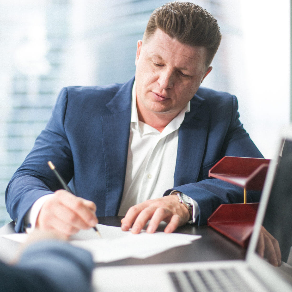
BUILDER
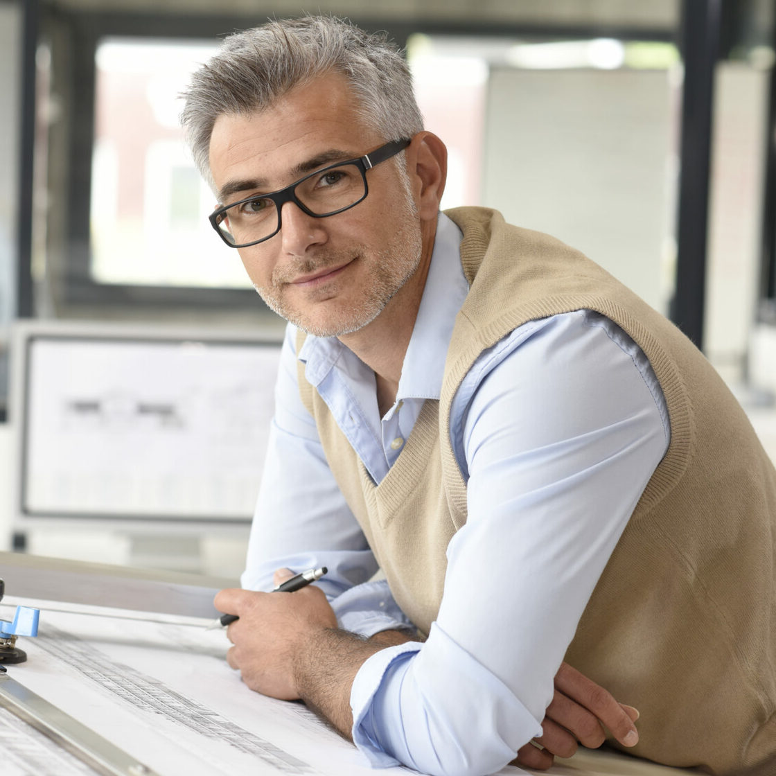
ARCHITECT
CUSTOMER
resents rising costs and unsatisfactory results
does not like that his plan was not fully realized
{02}
{01}
{03}
This is where economy, deadlines, technology and artistic intent collide, and POLYHEDRALS find a balance. They create solutions, smooth out rough edges, and help the parties engage in dialogue.
FROM SUBCONTRACTORS TO MARKETING


POSITIONING
When creating positioning, it was important to get away from the image of a typical company to grow
Our customer is a master of technology, who is not afraid to experiment, is able to create even in a strict framework and always finds profitable solutions.
The ability to easily complete a complex task has become the basis of positioning.
Such a company has the skills and technology to quickly and painlessly complete the project.
So we came to the brand metaphor.
We are like a Swiss knife that does not take away the pocket and comes to the rescue in any situation.


MNOGOGRANNIKI
NAMING
We have built the character of the brand on three parameters:
from architectural solutions to marketing strategies.
expertise
01
innovation
02
versatility
03
It was not protectable and did not reflect the necessary meanings.
Former company name
VIEW

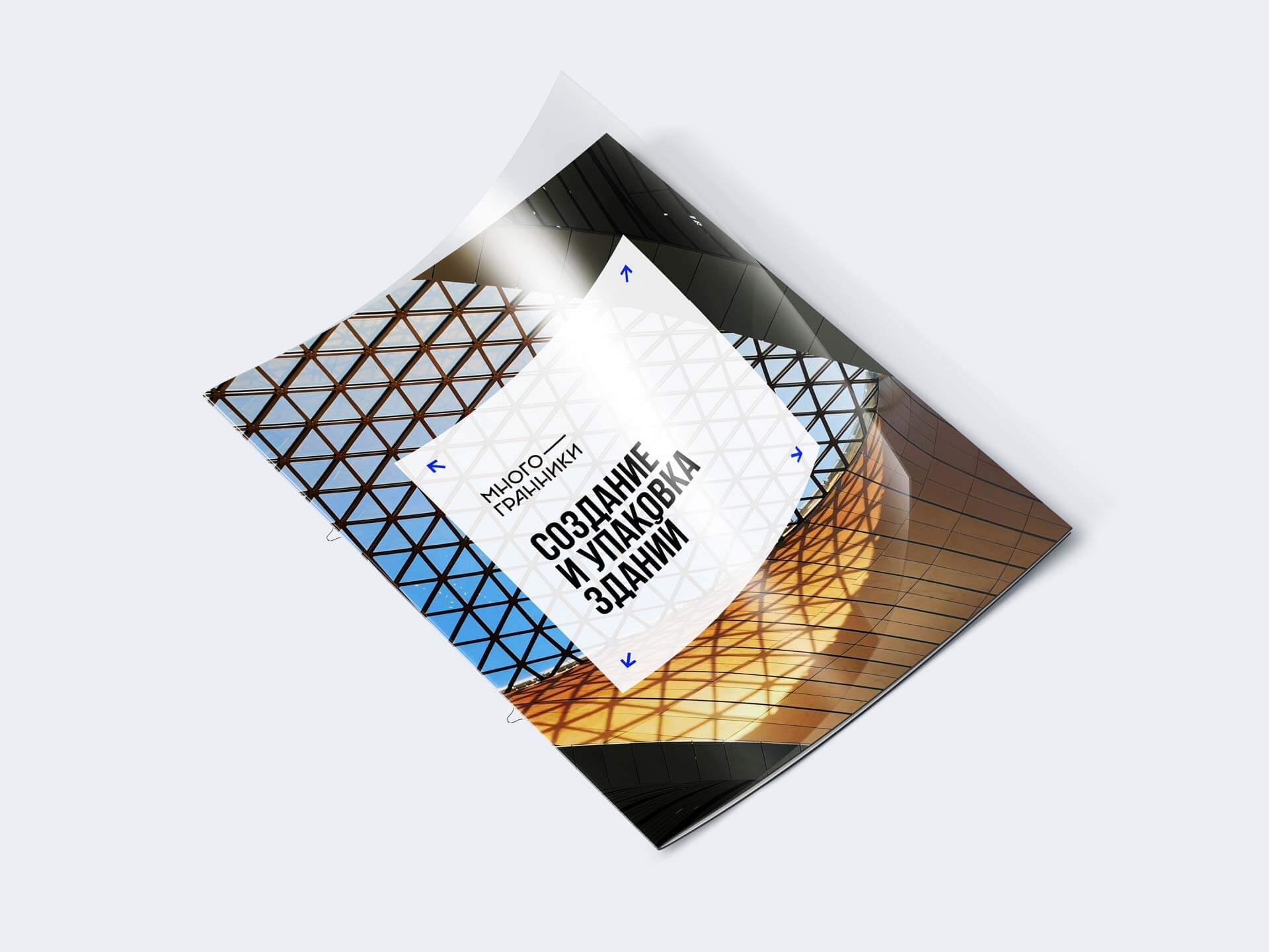
The facade of the building is like the packaging of goods on the store shelf.
The more correctly it is done, the more people buy the product
This is the very uniqueness that the updated brand can offer to its customers.
Proper building packaging
Фасады и интерьеры - ключевой элемент привлечения посетителей в коммерческие объекты. Так появился слоган:
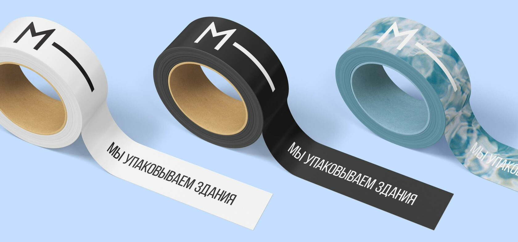
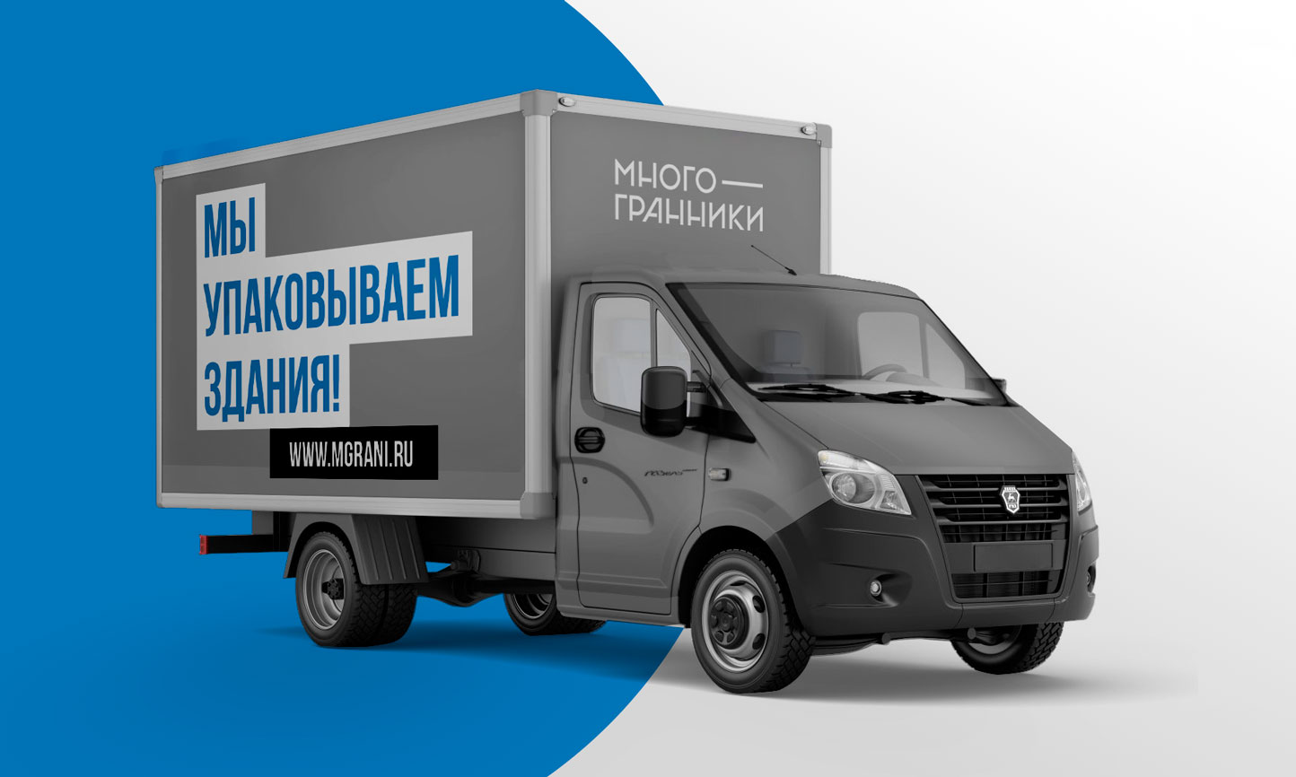
We pack buildings
A name filled with many meanings, each of which works to strengthen the brand.
It metaphorically reflects the essence of the company's work and the key communication approach - the facade as a selling package.
Facades and interiors are a key element in attracting visitors to commercial properties. This is how the slogan came about:

It reflects a comprehensive approach that combines many facets:


VISUAL STYLE
We have developed a logo that combines font styles and architectural and construction elements. The result is a modern technological sign with a pronounced rhythm.
The median line symbolizes both an element of the building structure and the production process: it is from a simple line in the drawing that an architectural design is born.
Such a graphic solution allowed us to make a deliberate visual accent and improve the readability of the title.


it transforms depending
on the host
on the host
We have created
a logo-constructor
a logo-constructor

THE PROJECT WAS MADE BY
Alexandra Chebotareva
Egor Smirnov
Artur Sagitov
Egor Smirnov
Artur Sagitov
Project team:
Alexander Glazov
Alexey Ignatiev
Alexander Glazov
Alexey Ignatiev
