By early 2016, the farm was supplying local markets with meat and poultry, fish, eggs and dairy products, as well as feed mixtures made from natural ingredients and herbal preparations.
The Bogdanovs were ready for development: they wanted to expand their reach and scale sales but for this the family business needed a strong brand that could withstand the rapidly growing competition in the private household market.
The Bogdanovs were ready for development: they wanted to expand their reach and scale sales but for this the family business needed a strong brand that could withstand the rapidly growing competition in the private household market.
In 2011, Andrey and Evgenia Bogdanov started breeding animals to provide themselves and their families with natural products: they bought a cow, eight rams, three goats and several dozen chickens. The land, which had been resting for the last 40 years, had accumulated a deep fertile layer and was ready for cultivation.
The family did not even think about commerce, but the farm quickly grew, and its surplus began to be sold to neighbors. For four years, private entrepreneurs have been mastering in order to enter the market in the spring of 2015 as a full-fledged supplier of natural products. Then they gave their farm the name - "Brahma".
FAMILY BUSINESS NEEDED A STRONG BRAND TO MAKE A GREAT COMPETITION ON THE HOUSEHOLD MARKET
ABOUT COMPANY


RESEARCH
RESEARCH SHOWED: BUYERS TODAY LESS TRUST IN LARGE RETAIL CHAINS giving preference to locally produced natural products
Competitive advantages such as a long shelf life and delivery from the most favorable region for farming are no longer a purchase criterion: if the product has endured a long journey and has not lost its attractive appearance, this is an occasion to think about its composition and ask the relevant question: "Is this food dangerous?" for the body?
A sign of quality is a short shelf life. Only local producers can fill the market with such products, which makes private farms a priority.
A sign of quality is a short shelf life. Only local producers can fill the market with such products, which makes private farms a priority.

Not the last role in this matter is played by the fact that the main buyers of the 21st century are women: it is they who purchase the vast majority of goods in each segment. At the same time, when choosing a specific product, personal attitude often plays a more important role than rationality: therefore, women are ready to consciously choose farm products over and over again, even if such a purchase is relatively more difficult than going to a hypermarket.
Thus, we determined the target audience of the brand: these are families with children from 3 to 14 years old, where a woman does housework, and a man earns money. They support traditional values and continuity of generations.
Thus, we determined the target audience of the brand: these are families with children from 3 to 14 years old, where a woman does housework, and a man earns money. They support traditional values and continuity of generations.
THE MAIN BUYER IS WOMEN, WHICH ARE DIVIDED INTO TWO SUB-CATEGORIES
Such customers have everything according to plan: they make a balanced menu for the week ahead, trying to get the maximum benefit from each product. The attitude to poultry meat is calm: it should be in the diet, but it is not the basis. Such housewives know how and love to cook, but a delicious table for them is not a goal, but a means to achieve the health and well-being of the family.
For these customers, poultry meat and milk are the basis of their daily diet. They know how and love to cook: for such housewives, housekeeping is not only an opportunity to show their care to relatives, but also a way of self-expression.
EFFICIENT HOSTS
KEEPERS OF THE HEART


Fresh and high-quality product - provides a rich taste
100% Natural Formula - guaranteed benefits
Professionalism based on personal experience - emphasizes responsibility
POSITIONING
Based on the research results, we formulated
MAIN COMPETITIVE ADVANTAGES OF FAMILY FARM PRODUCTS
Positioning
DELICIOUS FARM PRODUCTS
Positioning metaphor
A TOOL FOR FAMILY PRESERVATION AND PROSPERITY
At the same time, the farm not only solves many household issues of customers, helping them gather their families at a rich table every day, but also takes responsibility for the revival of the national industry of private farms that supply natural and tasty products to local markets.

NAMING
BRAHMA
At the very beginning, the farmers named their farm after the breed of chickens - "Brahma", but this word was not protected and did not evoke figurative associations among buyers: an incomprehensible European sound was an obstacle that alienated the farm from the target audience.
The new name was supposed to be family oriented, traditional in a good way and create a sense of reliability. All these meanings were reflected in two words - "Native palms."

old
name
name
We work with our hands, but through our palms we share our emotions. The name of the brand reflects these meanings, evoking the image of the father's strong calloused hands, which will always protect and support, and the soft motherly hands, giving love and warmth.
"Rodnyye Ladoni" - opposition to industrial production. These are homemade products designed to please loved ones and feed a large family.
LOGO

"Rodnyye Ladoni" is, first of all, a family that is engaged in a common cause. They are farmers, but their goals go much deeper than making a profit. With their work, they promote many values: the right attitude to the land, ecotourism, the restoration of peasant farming traditions and preservation of unique breeds of domestic animals.
In order not to tie the brand solely to farming and create a strong foundation for development in any field, we chosen the coat of arms as the main visual image. This symbol reflects family, emphasizes responsibility and fidelity to traditions.
The family coat of arms of the "Rodnyye Ladoni" is divided into four parts, in each of which is one image, symbolically denoting cattle breeding, poultry farming, fishing and farming. The reading order of the four-part coat of arms reflects the priority of the farms: in the first place is - red and white meat; secondary fields are reserved for fish and plants.

Additional stylistic elements were not chosen by chance: they don't just give the logo a visual and semantic completeness, but and fill it with historically correct meanings. So the crown crowning the shield, in its shape corresponds to the crowns depicted on the coats of arms of rural populations.
The font part of the logo is made in a modern version of the antiqua, the truncated strokes of which add modernity to the classic styles.
In this way, we achieved a visual correspondence of the brand name to its content, while demonstrating respect for the experience of ancestors and willingness to develop together with technologies.
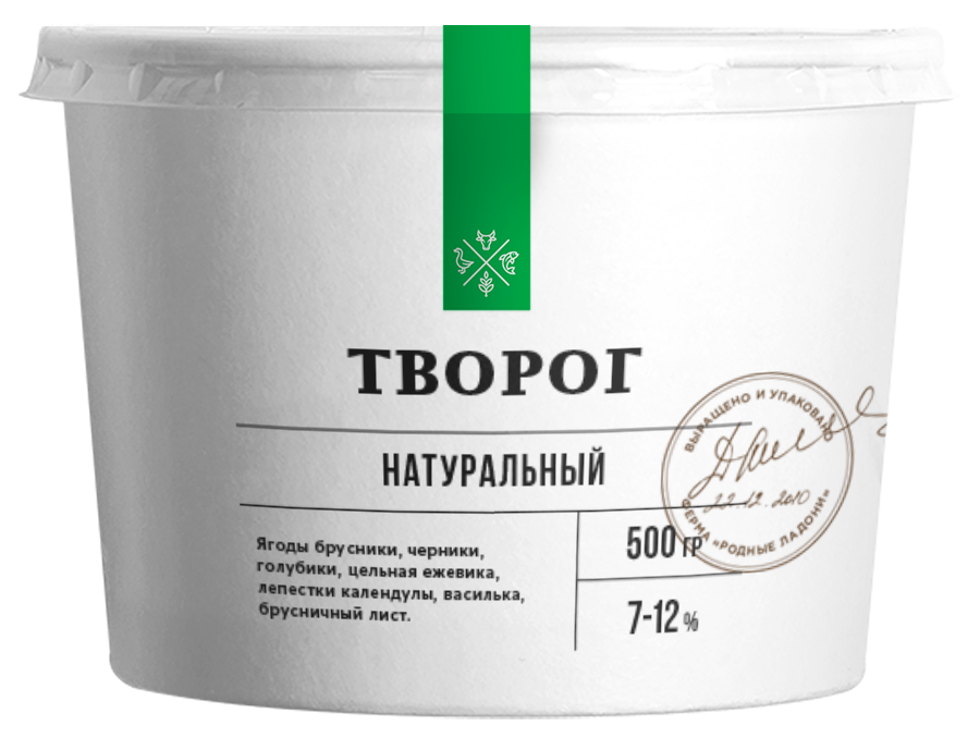
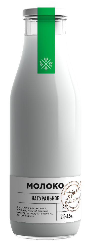
VISUAL STYLE
THE IDENTITY OF THE "RODNYYE LADONi" IS BASED ON A COMBINATION OF SIMPLE ELEMENTS associated with farming:
GLASS
TWINE
CRAFT
Such a minimalist approach is relevant in the context of modern aesthetics and is beneficial for the brand, because it allows the buyer to examine the product and logo - remember the manufacturer and correlate the high quality of the purchase with him.
THE COLOR PALETTE IS MADE IN COMPLEX, EXPRESSIVE SHADES
GREEN
The shade we have chosen is a contrast to the color of the first spring grass replicated on the market. Such bright greenery is appropriate for branding in retail stores that need to emphasize the freshness of their products.
In our case, this question recedes into the background: the production of "Native Palms" is fresh a priori. That's why we laid a completely different meaning into green. with it, we emphasized the experience and returning to roots: here the green is not expressed as brightly and adding a yellow tint hints at autumn palette - Harvest time. Among other things, this shade stands out from the general mass, attracts the eye and looks especially noble against the background of the same type of competitors.
DARK BROWN
As the darkest color in the palette, we chosen not classic black, but dark brown.
The semantic content of this shade is read on a subconscious level: the color of plowed fertile land.
As the darkest color in the palette, we chosen not classic black, but dark brown.
The semantic content of this shade is read on a subconscious level: the color of plowed fertile land.
BROWN AND PALE BROWN
These two colors go together and are complementary. Their hue corresponds to the darkest color in the palette, but saturation is chosen to match the complex green and emphasize its expressiveness.
These two colors go together and are complementary. Their hue corresponds to the darkest color in the palette, but saturation is chosen to match the complex green and emphasize its expressiveness.
Project team
Alexander Glazov
Alexey Ignatiev
Artur Sagitov
Natalie Cristea
Alexander Glazov
Alexey Ignatiev
Artur Sagitov
Natalie Cristea
On January 19, 2018, Rospatent issued a certificate of registration of the trademark "Rodnyye Ladoni"
Case text
Egor Smirnov
Egor Smirnov


