
Store chain brand for the HoReCa market
HoReCa is an abbreviation of words denoting places of sale and consumption of goods: Hotel, Restaurant, Cafe

Вы можете прослушать кейс в автомобиле или в такси по дороге домой.
challenge
To develop a brand for a wholesale and retail store of goods for the HoReCa market:
01
Market research
02
Brand strategy
03
Positioning
04
Naming & tagline
05
Logo & visual style
06
Functional space
01
02
03
04
05
06
about company
The company is engaged in wholesale and retail sales of packaging, disposable tableware, napkins, household chemicals and products for confectioners.
Territory: North Caucasus and Northwestern Federal District Headquarters: Grozny
Main direction: HoReCa
Main direction: HoReCa
Service
It provides goods to two main categories of customers:
Who are the clients: buyers from cafes, restaurants and hotels, less often - private buyers.
What do they buy
· Disposable tableware
· Napkins and towels
· Packages and containers
· Serving items
· Eco-ware and eco-packaging
· Everything for cleaning
· Inventory
· Napkins and towels
· Packages and containers
· Serving items
· Eco-ware and eco-packaging
· Everything for cleaning
· Inventory
Confectioners
Who are the clients: amateur confectioners, small productions and private bakeries.
What do they buy
· Ingredients, ready mixes
· Flavors and dyes
· Decorative elements
· Bakeware
· Cooking Tools
· Stands, boxes
· Flavors and dyes
· Decorative elements
· Bakeware
· Cooking Tools
· Stands, boxes
All clients are divided into two groups:
B2B
B2C
Restaurants, cafes, bakeries, pastry shops and hotels. Buyers, as a rule, are managers, owners or entrepreneurs who value speed and clarity, because their work directly depends on supplies.
Private clients who organize their life and delight loved ones. They are bought a lot for family celebrations and holidays.
Before applying to a branding agency, the company already had two stores in Grozny.
The plans include expanding the range, selling goods under their own brands, entering the markets of the Southern and Central Federal Districts. All this required the creation of their own brand.
The plans include expanding the range, selling goods under their own brands, entering the markets of the Southern and Central Federal Districts. All this required the creation of their own brand.
research
Audience motives
Despite globalization, traditions and habits remain in each region, which are important to consider when creating a brand.
To understand the company from the inside, we went to Grozny, where we were convinced that in the North Caucasus there are almost no boundaries between business relations and friendship, here the mentality significantly affects all business processes.
To understand the company from the inside, we went to Grozny, where we were convinced that in the North Caucasus there are almost no boundaries between business relations and friendship, here the mentality significantly affects all business processes.
"We are valued for simplicity. This does not interfere with business, it is a matter of mentality. We provide individual prices and allow borrowing. The main thing is the human approach"
Head of Sales at Fortime
After talking with store visitors, we formulated the following values:
- CommunicationFor customers, the store is a meeting place for the business community, where owners and suppliers can discuss useful little things to improve efficiency and quality of service.
- ConfidenceAnyone who sells goods in Grozny vouches for the quality, but not on behalf of the companies or the store, but personally on their own behalf. Here success is determined by the trust of buyers to specific sellers.
- RelevanceThe service sector is developing, it is subject to fashion, tastes and preferences of the audience. Therefore, customers perceive the store as a supplier of ideas and new approaches.
positioning
HoReCa products are not a unique product of our customer, they are also sold by other market participants. The main difference from competitors lies in the knowledge of the needs of customers: some need installment plans, others need warehouse space, and others need delivery on the day of order
The new brand is more than just products. The company tells and suggests how to preserve the temperature, appearance and quality of the product with the help of the right materials, promoting trends in safety and practicality.
The goal of the brand is not to sell as much as possible - it finds a "smart" product that can solve the unique problems of each client.
The goal of the brand is not to sell as much as possible - it finds a "smart" product that can solve the unique problems of each client.
For each client there is a "smart" product. The task of the brand is to find it and provide additional services depending on the needs.
So, we formulated the positioning hypothesis:

The market is full of names with the root "pack", this significantly reduces the ability to stand out from the competition;

The product range has not been limited to packaging for a long time;
The company moves to online sales;
"Megapack" is already a registered trademark of another company.
naming
For the last 15 years, the company has been operating under the name Megapak. There were several reasons to change it:
The neologism "Fortime" was chosen as the name of the brand, the basis of which were the words:
• forte – strength, perseverance • forte – strength, perseverance
• форт – крепос • fort – fortress, protection • fort – fortress, protection
• time – on time • time – on time • time – on time
Service provision
fortime
The main spelling of the name has become Cyrillic, because the geography of the brand's presence involves development primarily in Russia. However, neologism is well perceived by the languages of the Latin group and easily adapts to the European sound.
Goods for confectioners
Product group brandline for Horeca:
Brandline of confectionery group:
For external communications, we have created the slogan "First in order", which involves several semantic categories:
Tagline
Emphasizes the company's leadership in the niche of HoReCa products.
Emphasizes the ambitions of the brand, which plans to enter new markets.


logo
The Fortime logo consists of a text and a symbolic part. The iconic part is built on the basis of a circle connected by two plexuses of four colors.
This geometric design is visually related to both the packaging and caring hands hiding something valuable in the palms. The metaphor of service and care as the main value of the company became the basis of the sign.
Raspberry shades - goods for confectioners, symbolize the holiday and the brightness of taste.
Azure shades - providing service, symbolize purity and freshness.
Gray and silver are additional colors used as background and font solutions. Their neutral nature allows you to keep the overall range, making the palette richer.
For the successful development of the brand, it was important to choose neutral visual solutions. The palette is formed on the basis of a range of five primary colors: azure, sea breeze, crimson, crimson peak and saturn.

visual style
The corporate pattern is a key element of the visual identity of the Fortime brand. A seamless pattern is built by multiplying a graphic element both horizontally and vertically.
Style-forming graphics consist of logo elements and are used only in combination of two objects of the same color.
Pattern
store space
Head of Sales at Fortime
"People are shy: coming into the store, the buyer will tell you anything so that you get rid of him. If you didn't guess right with the price or offer, the client will simply answer "no", and you won't understand why"
People don't like everything new, so the primary goal is to make their contact with the store easy and pleasant, so that they want to return. To do this, we thought over the functional space of the trading floor, where the buyer can easily navigate without outside help and will not get confused in the goods.

Signboard
The signboard is a corporate block of the Fortime logo and is placed above the main entrance to the store. All elements are equipped with internal lighting.
Pillars
The signboard is a corporate block of the Fortime logo and is placed above the main entrance to the store. All elements are equipped with internal lighting.

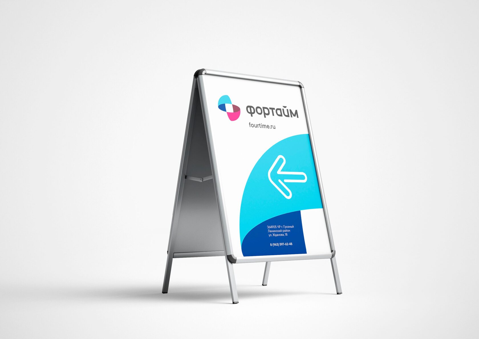
Stoppers
Regular price tags can be supplemented with special stopper plates.
"Discount" and "New" to further attract the attention of buyers. The main background of the "Discount" plates is an additional yellow color. "New" - an additional turquoise color.
"Discount" and "New" to further attract the attention of buyers. The main background of the "Discount" plates is an additional yellow color. "New" - an additional turquoise color.
Project team
Natalie Cristea
Artur Sagitov
Egor Smirnov
Alexander Glazov
Alexey Ignatiev
Natalie Cristea
Artur Sagitov
Egor Smirnov
Alexander Glazov
Alexey Ignatiev