

Development of a private label brand (STM) for household goods of a wholesale and retail store
CHALLENGE
Develop a private label brand for household goods of a wholesale and retail store

ABOUT COMPANY
The task of brand development largely consisted of the need to increase brand awareness and
increase the average check

Although the manufacturer was already known in the North Caucasus, the next step - entering other regions and increasing work with the B2C segment - required changes and the creation of a new brand.
RESEARCH
The initial ratio of clients from b2c and b2b was 15% to 85%, respectively, so when creating a new brand, we relied on businessmen: owners of cafes, restaurants and commercial enterprises for whom household goods are a daily necessity.
15% of the brand's total customers are individuals. They value quality, durability and convenience - for example, the ability to find all the necessary goods in one place.
The increase in the range and the launch of new product lines made it possible to satisfy the needs of this part of the audience.
The increase in the range and the launch of new product lines made it possible to satisfy the needs of this part of the audience.
WHAT A COMPANY SHOULD LOOK
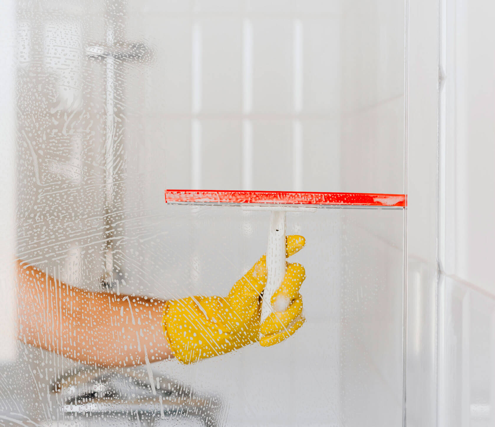
A brand of household goods should be the solution to all problems for the client.
The main task is to remove the "pain syndrome" of cleaning. The values of this concept boil down to three concepts
The main task is to remove the "pain syndrome" of cleaning. The values of this concept boil down to three concepts
Breaking the stereotype that cleaning is always hard and exhausting
Ease

Professional support even in purely domestic matters
Mastery

Opportunity to try new tools that will make life better
Innovation


VALUES
Our positioning is based on customer expectations
Customers expect transparency from the company they do business with.
Transparency
Customers want to feel like they are in control of the process from start to finish.
Control
Customers need product and payment choices to feel free.
Variability
Clients need information. Businesses should invest in educational content, knowledge base (faq) content, and regular communication with customers.
Information
The best
Audience №1
Advanced caretaker. They keep the business in their hands. Immersed in small processes. Choose the best, make the choice yourself.
85% - B2B
There are more important things
Audience №2
It is important to provide the business with the essentials. Not fanatical. Not so much immersed in the purchase (made an order by phone - arrived - picked up).
Can save money
Audience №3
Save on small details. The most important thing is the benefit. Ready to buy the cheapest, just to clear the dirt.
Good host
Audience №1
Take care of loved ones and express themselves with the help of everyday life. For such clients, home comfort is not limited to cleaning: they earn attention and praise by showing their housekeeping in all ways.
This is delicious food, and ironed clothes, and a clean house. All this is closely connected with convenient and effective means that help to achieve an impeccable result.
This is delicious food, and ironed clothes, and a clean house. All this is closely connected with convenient and effective means that help to achieve an impeccable result.
15% - B2C

NAMING
The neologism CLINCOR became the name of the new brand. The basis for its creation were the words:
clean
core
Neologism is equally well read both in Russian and in English, its pronunciation is clear and does not cause difficulties.
This is important, since the brand plans to expand the geography of its presence and does not exclude the possibility of working not only with neighboring regions, but also with European countries. The main spelling of the name was English.
This is important, since the brand plans to expand the geography of its presence and does not exclude the possibility of working not only with neighboring regions, but also with European countries. The main spelling of the name was English.

The main variant of the brand's slogan was the phrase "Cleanliness mastery", because the list of goods for the most part consists of products for maintaining order. However, this was not enough to reflect the entire range.
Tagline
CLEANLINESS MASTERY
We decided to make the slogan a changeable element. The word "skill" has become a static unit - a constant quality, the shade of which is determined by a dynamic unit.
For products from the category "cleaning" as such a unit, we have chosen the word "cleanliness" - "Cleanliness mastery". Products for decorating the dining table, we have chosen the word "serving" - "Serving mastery".
For products from the category "cleaning" as such a unit, we have chosen the word "cleanliness" - "Cleanliness mastery". Products for decorating the dining table, we have chosen the word "serving" - "Serving mastery".
Depending on the category of goods, the slogan can be supplemented with the necessary semantic meaning.
Thus, CLINCOR got the opportunity to expand the range in any direction without restrictions from the brand positioning.
Thus, CLINCOR got the opportunity to expand the range in any direction without restrictions from the brand positioning.
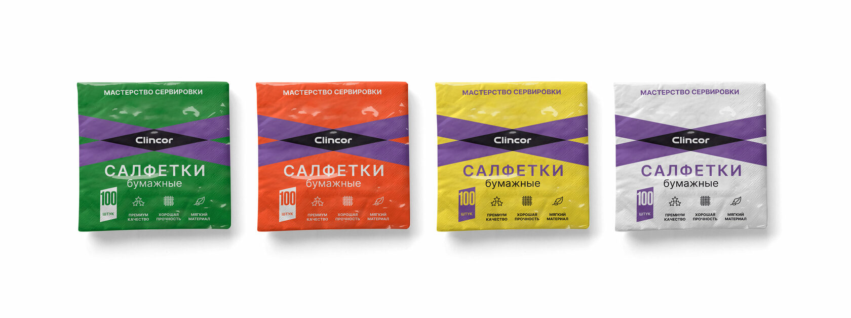
MASTERY SERVING

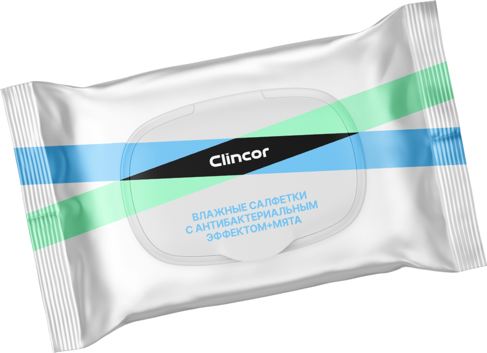
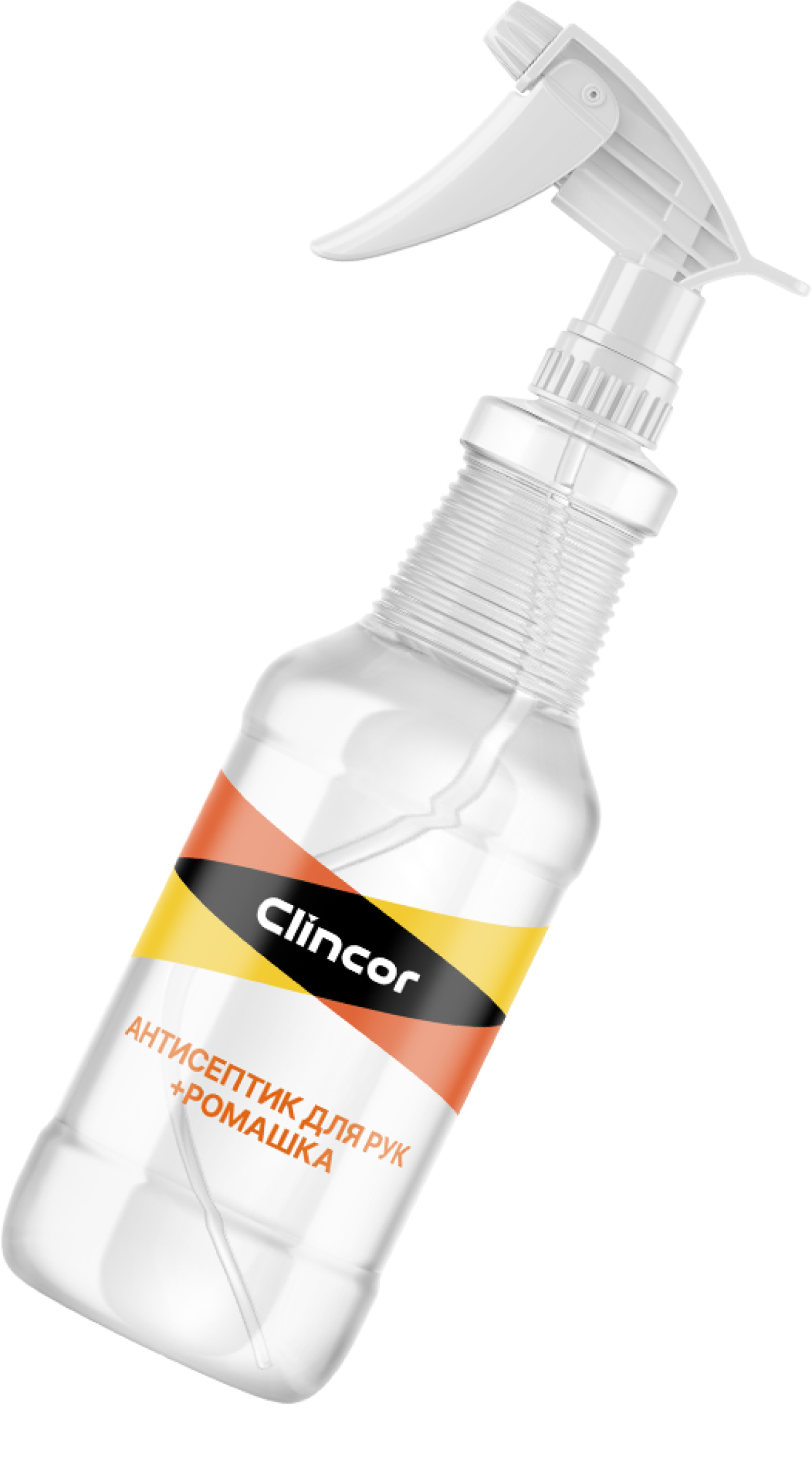
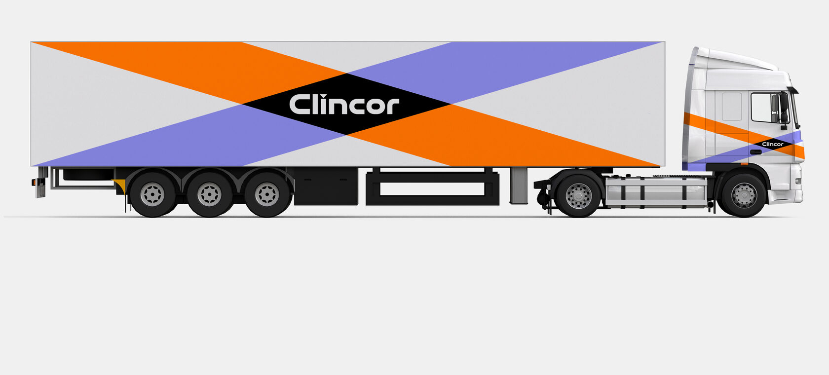
The CLINCOR logo is the intersection of two rectangles with the brand name in the middle of the formed rhombus. The visual concept of this sign encodes "the merging of elements into one whole."
Thus, subconsciously, the buyer perceives the brand's products as a valuable acquisition even before the actual purchase.
The main meanings are complemented by more practical associations: this form of the logo resembles a ribbon used to tie up an expensive gift.
LOGO


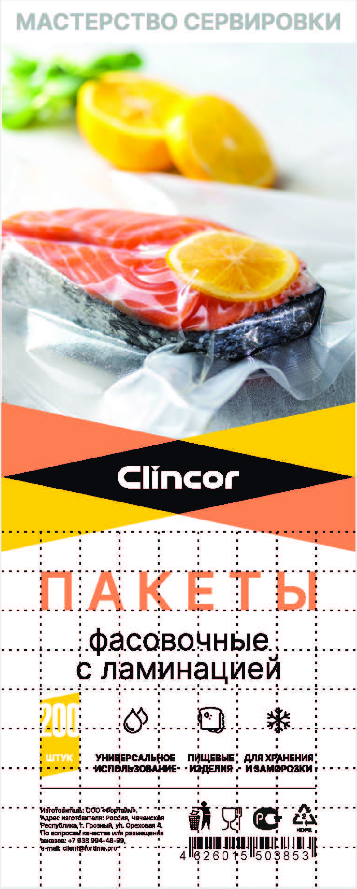
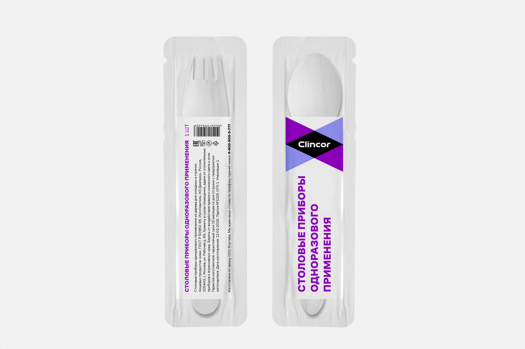
A color coding was also created for more than 10 groups of goods divided by functional affiliation: for serving - yellow, for serving - blue. In addition, internal color division allows you to highlight the size formats of each product.
The color scheme of the logo is variable and changes depending on where it will be applied. This approach helps to segment products into categories.
The rhombus formed by the intersection of four colors is painted black. This element emphasizes the brightness of other shades and remains static regardless of the logo transformation options.
The brand name in the center is written in contrasting white. The font styles have been developed specifically for CLINCOR. The sans-serif sans-serif combines right angles and smooth curves: the combination of these elements emphasizes the progressiveness and manufacturability of the brand's products.
70% of millennials buy a product not because of the benefits, but because of the attractive package design
This is not a matter of individual taste, but a pattern of elements that the brain perceives as the most pleasant. For example, colorful and contrasting packaging has been proven to increase sales. It is this principle that is used in the CLINCOR logo.
PACKAGE
Consumer trends today - minimalism and informative
This is especially important in the context of private labels, which should both stand out on store shelves and not irritate customers with excessive variegation.
The main elements of the packaging design of the CLINCOR brand products - logo and slogan
The design is thought out in such a way that even minor information is assimilated by the buyer in a matter of seconds. Icons reflecting the characteristics of goods have become one of the mandatory elements of packaging. For each product, these marks are individual, demonstrating its unique properties and uses.
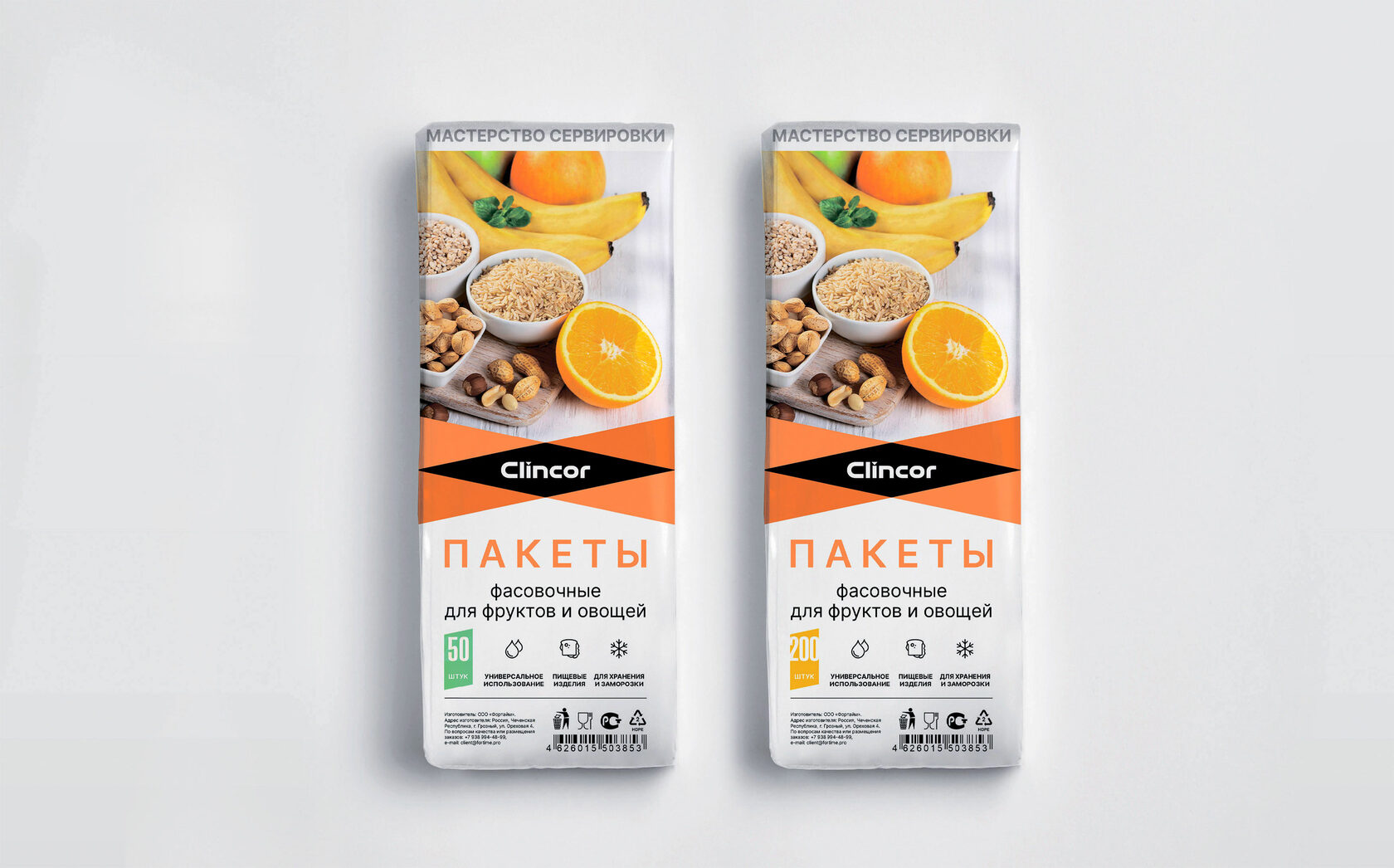
Additional elements were designations showing products of the same line. This is reflected in the concept of color solutions, which the eye perceives much faster than any other information.
On March 18, 2021, Rospatent issued a certificate of registration of the trademark "CLINCOR"
On March 18, 2021, Rospatent issued a certificate of registration of the trademark "CLINCOR"

Project team
Philip Olenikov
Egor Smirnov
Alexander Glazov
Alexey Ignatiev
Sagitov Artur
Natasha Cristea
Timur Karimov
Philip Olenikov
Egor Smirnov
Alexander Glazov
Alexey Ignatiev
Sagitov Artur
Natasha Cristea
Timur Karimov